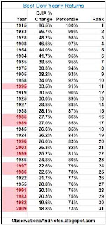
The Best Dow Yearly Returns since 1900
The above table (click to expand) shows the best yearly performances of the DJIA (Dow Jones Industrial Average) index since 1900. I was originally going to show the top 25% (75th percentile and above), but expanded the range slightly to include 2009, a recent year of special interest. Note that the returns listed represent
only the percentage change in the index itself and do not include dividends.
The best year, 1915, had an extraordinary return of 86.5%. Even the 30th best of the 113 years produced a return of close to 20%.
I've highlighted the most recent years; years after 1980 are highlighted in red. It's worth noting that (12/31=) 39% of the best years ever have occurred since 1980, even though the years since 1980 represent only 29% of the total years in the database. Thus, even after the last 10 years of flat returns, overall the last 30+ years is still arguably the "frothiest" period in stock market history.
The Worst Dow Yearly Returns since 1900
The above table shows the 30 worst years. The worst year, 1931 resulted in a loss of 52.7%. Note that the worst year of the Great Depression bear market was significantly worse than 2008 -- the worst year of the recent (/current?) bear market. It would have taken more than a 100% gain to recover from that loss. The 30th worst loss, on the other hand, was a loss of only about 4% -- not bad, especially when compared to a 30th best gain of about 20%.
I've again highlighted the years since 1980. In this case, only 6 of the 30 worst years occurred after 1980. Thus, only (6/30=) 20% of the worst years occurred after 1980 even though those years represent about 29% of the database. That again suggests we've led a bit of a charmed life in the last few decades.
Implications re: Long Flat Periods in Stock Market History
In 100 Years of Stock Market History, I argued that "In the long term, you would expect that stock market performance should approximate the performance of the underlying businesses." You could argue that these tables at least raise the suspicion that even now market prices might still be ahead of the sustainable underlying earnings (though you could also argue that I've obviously stacked the deck by starting in 1981 -- the beginning of a bull market).Related Posts
Best & Worst Market Returns for 1, 2, ... 100 Years: What are the best & worst returns for 2-year periods? 3 years? .... 100 years? (In chart form)The Best & Worst (Rolling) 5-Year Returns, Best & Worst (Rolling) 10-Year Returns, 20 Years, 35 Years, 50 Years
Stock Market Annual Performance since 1929: Bar chart of yearly returns
Yearly Market Returns Frequency Diagram & 10-Year Market Return Frequency Diagram e.g., how often were returns between 10 & 20%? "Histograms"
The Extraordinary Impact of P/E Ratio on Yearly Returns
Stock Market Earnings Growth History: historical growth of sustainable earnings
An interesting view of yearly S&P 500 performance from Daily Kos
For lists of other popular posts and an index of stock market posts, by subject area, see the sidebar to the left or the blog header at the top of the page.
Copyright © 2011. Last modified: 1/4/2013


Impressive! I really like your blog.
ReplyDeleteThanks for the post.
Annual return