Yearly Returns Driven by Changes in Valuation: Earnings Multiple Expansion & Contraction
In a previous post in this series, I introduced a stock market analysis model/spreadsheet that allowed us to analyze the contribution that earnings, dividends and the change in price-to-earnings (p/e) ratios made to the performance of the Dow for any period during its more than 100 year history. As an example, we looked at DJIA (Dow Jones Industrial Average) total returns from 1994 to 1999 and observed that a large percentage of the annual return during this exciting period was due to an increase in the price/earnings ratio. This is sometimes called an increase in valuation, or earnings multiple expansion.Is this typical in stock market history? Does a bear… Oops. How about “You betchum, Red Ryder” instead (if you have no clue who Red Ryder was, you can just ignore that comment). The variation in yearly returns is dominated not by earnings or dividends, but by valuation, by expansion and compression of the earnings multiple – though not typically to the extent that we saw in the bull market of the 1990s. On the other hand, in some ways the extremes give us the best clues about what’s really going on.
The Historical Impact of Price/Earnings (P/E) Ratio
Components of Yearly Stock Market Returns
normalized earnings (NE) growth, dividends and the change in the normalized price to earnings ratio (NPE) from 1920 to 2003. It tells the same story. Historically, looking at year-to-year changes, the impact of expansion and contraction of the earnings multiple -- the white bars in the chart -- dwarfs the impact of changes in the earnings and dividends. In the long term, of course, that cannot be true. When you look at returns over 50-year periods instead of one-year periods, Earnings & Dividends Contribute Most to Long-Term Stock Market Returns. The contrast between the one-year chart above and the 50-year chart is striking.
(Note: For a discussion of NE and NPE, see this post.)
Analyzing the Stock Market Crash 1929-1932
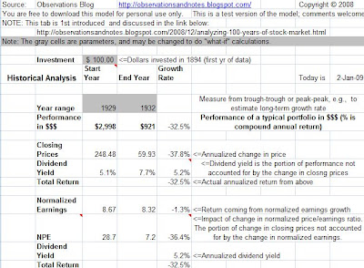
The screen shot below (click to enlarge) is from the same model, and focuses in on the stock market’s performance between 1929 and 1932. (Note: see the 1929 stock market crash chart for a more detailed graph of 1929-32.) The period leading up to 1929 was very similar to 1994-99. However, the 1929-32 period is in many ways the opposite; the stock market crash in 1929 was the beginning of the Great Depression. During this three-year period, investment portfolios lost an average of about 32% per year; a $3,000 portfolio would have been reduced to less than $1,000. It would have been worse if investors had not earned about 5% per year in dividends.Notice, though, that only about 1% of the yearly loss was attributable to the change in normalized earnings! The decline in yearly (non-normalized) earnings was, of course, much more dramatic – earnings went from almost $20 to a loss of about $0.50. You could make the argument that more than 100% of the change in the Dow’s price from 1929 to 1932 was the result of changes in valuation. The normalized price/earnings ratio, or the ratio of price to normalized earnings, went from approximately 29 -- to 7; the (normalized) earnings multiple declined by over 36% per year, whereas total return was down “only” 32.5% per year.

Analysis of 1929-1932 Stock Market Crash
Note that while this is Dow Jones data, the results for the S&P 500 are essentially the same. I don’t know anything about electrical engineering, but if I did, I'm guessing I’d be writing something about signal-to-noise ratios….
Here is a link to the current Stock Market Analysis Model mentioned in the intro (see the Historical Analysis tab). I will add additional features (tabs) to the model, and continue the analysis in future posts. Note: If you have trouble downloading the spreadsheet, see this post.
Share This Article
Bookmark this on Delicious
See below to share via Facebook, Twitter, etc.
RELATED POSTS
Other Posts in this SeriesComponents of 10-Year Returns: Same graph as the lead graph in this post, but for 10-year returns (contribution of earnings growth, dividends and p/e). Very different results.
Earnings & Dividends Contribution to Long-Term Returns: Same graph, but for 50-year returns. Equally different.
Other Related Posts
Rolling Returns vs. P/E Ratio Graphs a different look at the impact of p/e on returns.
Starting P/E Ratio and 1-Year Stock Market Returns: and another (using a scatter diagram).
Dow P/E Ratio Impact on Future Returns - A Summary: the relationship between p/e ratios and future returns in dollars.
Dow Price/Earnings (p/e) Ratio History Since 1929 - Yearly Graph: a look at valuations over the long haul.
For an index of all stock market posts, by subject area, see the sidebar to the left or the header at the top of the page.
Last updated 3/26/2012

No comments:
Post a Comment
No spam, please! Comment spam will not be published. See comment guidelines here.
Sorry, but I can no longer accept anonymous comments. They're 99% spam.