A Common Retirement Planning Misunderstanding
Do you believe the longer you invest in the stock market the less risky it is? If so, your retirement plan may be riskier than you realize.
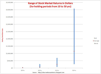
Graphs showing the range of returns over multi-year periods for the stock market as a whole usually look like an arrowhead (like the graph in this post). These graphs are easily misinterpreted. The difference between the best and worst rates of return gets smaller as the number of years increases; readers often assume that the difference between the best and worst outcomes as measured in dollars is also getting smaller. This is NOT the case -- as is clear from the graph below (click to expand).
Range of Returns for the Dow Jones Index (in Dollars, not Percentages)
Viewed in Dollars, Time INCREASES Variability
The graph above is based upon exactly the same data as the graph in the earlier post, and shows the results for the same theoretical investor, starting with an initial investment of $10,000. However, instead of showing the maximum, average and minimum annual percentage return for each holding period, it shows the maximum, average and minimum dollar value of the portfolios at the end of the holding periods. No one ever shows you this graph; it paints a very different picture of the variability in stock market returns.
The earlier graph, the one brokers and financial planners typically show you, makes it appear that the results are converging over time, and that time reduces variability. However, viewed in dollars, the results diverge with time. In dollars, time increases the variability, and, in a very real sense, increases the risk. In particular, the further out in time you are projecting in dollars, the further the best and worst cases are from each other, and the further each is from the average. That means that if you are planning on "average" results, your actual results could be very far from your plan.
The ($59,000 - $9,000=) $50,000 difference between the best and worst cases over 10 years seemed like a large variation when we were looking at dollar returns over 1-10 years. However, when you look at results from 10-50 years, that $50,000 is just a dot on the graph compared to the difference of over $3,000,000 at 50 years. What's going on here?
What's Going On?
We are again witnessing the "magic of compounding." The value of the ending portfolio is a function of both the annual return and time. The difference between earning 12.8% vs. 6.8% per year for 50 years is much larger than the difference between +19% and - 1% per year for only 10 years.
My original thought was that for this series of posts I would just replicate the original 1-100 year graph, replacing annual percentage returns with ending portfolio values (assuming a $10,000 investment). The reason I didn't do that is because in the 1-100 year graph in dollars, virtually every period we've looked at so far is reduced to a dot. That's because the difference between the 100-year best case (10.3% annual return) and the worst case (9.4%) is over $100,000,000! When returns are compounded year after year for many years, small differences can have a huge impact. As a result, even if the original investment was only $100, the difference between the 100-year best and worst cases would still be over $1,000,000! That's the magic of compounding. (See this post for some other examples.)
In the next post we'll look in more detail at the Implications of Stock Market Dollar Returns on Retirement Planning.
Note: Dow dividend income prior to 1929 has been estimated based upon another stock market index.
Related Posts
More detailed looks at variability for specific time periodsThe Variability of 10-Year Stock Market Returns, in Dollars A more detailed look at the 10-year bar in the chart above. e.g., what are the chances that $10,000 will grow to at least $40,000.
The Variability of 20-Year Stock Market Returns, in Dollars: For example, what are chances $100,000 will grow to $1,000,000.
Don't Plan Retirement Assuming Average Returns: An alternate treatment to the link immediately above. Shows the likelihood of 20-year results between the best and worst cases shown in this post -- e.g., of 6% returns.
Best & Worst Stock Market Returns for 1-10 Years in Dollars: same as this post but for 1-10 years.
What's causing the variability?
10-Year Rolling Returns vs P/E Ratio: Rolling return graph with addition of the P/E ratio at the beginning of each 10-year period.
Starting P/E Ratio vs. 10-Year Returns: Shows the 10-year returns that resulted from each initial P/E ratio. The classic way to investigate causation.
Components of 10-Year Returns: Breaks out how much of each 10-year return came from a) dividends, b) earnings growth and c) change in valuation.
For lists of other popular posts and an index of other stock market posts, by subject area, see the sidebar to the left.
This work is licensed under a Creative Commons Attribution 3.0 unported license.
Last modified: 1/23/2011
Share This Article
Bookmark this on Delicious
To share via Facebook, Twitter, etc., see below.

No comments:
Post a Comment
No spam, please! Comment spam will not be published. See comment guidelines here.
Sorry, but I can no longer accept anonymous comments. They're 99% spam.