Why Use Log Graphs for Long-Term Stock Market Graphs?
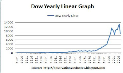
Some of you have noticed that on many of my stock market graphs, the "Y" (i.e., vertical) axis looks a little strange. That's because they are log graphs. Why, for example, is the 100-year stock market chart through 2010 a log graph? The simple answer is that if it was a "normal" (linear) graph it would look something like this....Dow Jones 100-Year Linear Graph

Dow Yearly Linear Graph
Not very enlightening is it? The problem is that, for example, a 100-point move looks the same in 1927 as in 2007 -- that is, you can't see it. A 100-point increase in the Dow from year-end 2007 to year-end 2008 would have been less than a 1% increase for the year -- hardly newsworthy (though WAY better than what actually happened!). However, the actual 100-point increase in the Dow from year-end 1927 to year-end 1928 WAS newsworthy -- it was a 50% increase.
Stock market graphs typically cover 5 years or less; in that case, normal linear graphs work fine -- unless it's an exceptionally volatile period with very large changes from year to year. For our purposes, we want a 50% increase to look the same whether it happens in 1927 or 2007; more to the point, we want a 50% increase to look the same if the Dow is at 200 as it does if the Dow is at 2000. That's the case with the log graphs. For example, notice that in the charts in the "100 Years" post, the distance between 100 and 1000 is the same as the distance between 1000 and 10000; a 10x increase is always the same distance. Also, note that the horizontal grid lines between 10 and 100 are in increments of 10; the grid lines between 100 and 1000 are in increments of 100, etc.
Technically, these are semi-log graphs-- that is, one axis is linear and the other is logarithmic. For a more in-depth discussion, see this article.
Another Example
For another example, see this post showing the 100-year history of the decline in the U.S. dollar. It has two graphs showing the change in the purchasing power a dollar since 1900. The first shows the decline on a normal, linear scale; the second uses a log scale. Compare the two and decide which you think is more useful.Last updated 4/22/2011
It shows the bubble we're in. I'd like to see it updated
ReplyDeleteActually, the problem with linear graphs is that it will ALWAYS look like we're in a bubble. That's why I normally use semi-log graphs like the one in 100 Years of Stock Market History -- which recently I've been updating monthly.
ReplyDelete