Saturday, November 14, 2009

Range of Stock Market Returns in Dollars: 10-100 Years

.

A Common Retirement Planning Misunderstanding


Do you believe the longer you invest in the stock market the less risky it is? If so, your retirement plan may be riskier than you realize.

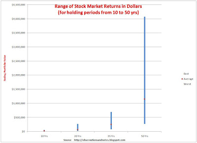
Graphs showing the range of returns over multi-year periods for the stock market as a whole usually look like an arrowhead (like the graph in this post). These graphs are easily misinterpreted. The difference between the best and worst rates of return gets smaller as the number of years increases; readers often assume that the difference between the best and worst outcomes as measured in dollars is also getting smaller. This is NOT the case -- as is clear from the graph below (click to expand).

Range of Returns for the Dow Jones Index (in Dollars, not Percentages)


Chart of best & worst stock market (Dow Jones) 10-100 year dollar returns
Range of Stock Market Returns in Dollars

Viewed in Dollars, Time INCREASES Variability


The graph above is based upon exactly the same data as the graph in the earlier post, and shows the results for the same theoretical investor, starting with an initial investment of $10,000. However, instead of showing the maximum, average and minimum annual percentage return for each holding period, it shows the maximum, average and minimum dollar value of the portfolios at the end of the holding periods. No one
Saturday, November 7, 2009

Range of Stock Market Returns in Dollars: 1-10 Years

Many investors think of stock market returns in terms of percentages -- e.g., Mutual Fund ABC returned 10.2%/year over the last 10 years. However, in my experience it is often useful to approach topics from multiple points of view. In this post, we'll look at historical stock market returns in terms of dollars; it's an especially important perspective when doing retirement planning.

Range of Stock Market Percentage Returns


In May, I posted a graph showing the historical range of DJIA (Dow Jones Industrial Average) returns for a variety of holding periods. That graph showed the results for a theoretical investor who bought and held the Dow for holding periods ranging from one to one hundred years, reinvesting dividends for the whole time. It seemed to show that the worst case got better with each passing year, and that historically the more years the investor held onto his investment the less likely he was to lose money.

Graphs like that one are often used to show investors that, while the stock market is very risky in the short term, the long-term investor faces much less risk. And that's true -- in a sense. It's especially true if the risk you are most concerned about is the risk of losing money (measured at the end of the holding period). Let's look again at exactly the same data, but from a different point of view.

Best and Worst Stock Market DOLLAR Returns for 1-10 Years


Chart of best & worst stock market (Dow Index) 1-10 year returns in dollars
Range of Stock Market Returns in Dollars

The graph above shows the results for the same theoretical investor, starting with an initial investment of $10,000. However, instead of showing the maximum, average and minimum annual return for each holding period, it shows the maximum, average and minimum value of the portfolios at the end of the holding periods. It confirms some things we already knew from the earlier graph (you may find it helpful to look at