Saturday, March 21, 2009

The 1929 Stock Market Crash Revisited

Worse Than Worst-Case Scenario?


What if we had a repeat of the stock market crash of 1929 -1932? In a previous worst-case post, I developed a worst-case scenario with the DJIA (Dow Jones Industrial Average) closing in the neighborhood of 4100. An alert reader suggests that is optimistic! He maintains that, if we were to repeat the 1929 crash, the Dow would fall to 2100.

Why the difference? The short answer is because my previous worst-case posts used very high-level, year-end data. The point I was trying to make in the earlier posts was that it would be prudent to at least consider the possibility of the Dow at levels that seemed unimaginable at that time. In this post, we will analyze daily data.

The 1929 (Great Depression) Stock Market Crash Graph


Daily chart of 1929-1932 (Great Depression) stock market crash

As you can see in the chart above (click to enlarge), the Dow peaked in September of 1929 and continued "steadily" downward through 1930 and 1931 until it bottomed in July of 1932; the Great Depression continued for some years afterwards. (Note: To see how this period fits in the bigger picture, see 100 Years of Stock Market History. If you are not familiar with log graphs like this one, see About Stock Market Log Graphs) The bottom line? A $10,000 investment in 1929 was reduced to

Tuesday, March 17, 2009

Average Stock Market Return Since 19xx

Stock Market Long-Term Average Annual Rate of Return
(e.g., since 1929; past 1, 5, 10, 20 ... years.)


What is the long-term performance history of the stock market? Throughout stock market history, the average yearly return for periods of 25 years or longer has been around 9-10%. Here we mean total return -- i.e., including dividends. Following are the results for some periods of particular interest; results are through year-end 2012.

Average Stock Market Return per year: Last 5, 10, 20 ... Years

  • The long-term, more than 100-year performance: Since 1900 (end-of-year 1899), through 2012, I estimate the average total return/year of the DJIA (Dow Jones Industrial Average)  was approximately 9.4%  -- 4.8% in price appreciation, plus approx 4.6% in dividends. (Some numbers may not add up due to rounding.)
  • Since 1929 (year-end 1928 -- i.e., before the crash), through 2012, the return was 8.8% (4.6%, plus 4.2%) [note: see The 1929 Stock Market Crash]
  • Since end-of-year 1932 (i.e., after the crash): 11.1% (7.0%, plus 4.2%)
  • The average annual stock market return for the past twenty-five calendar years (since 1987) was 10.6% (7.9%, plus 2.7%)  The market was up over 40% before the October 19, "Black Monday," crash. After a significant recovery, the Dow actually closed up 6% for the year.

Saturday, March 14, 2009

About Stock Market Log Graphs

Why Use Log Graphs for Long-Term Stock Market Graphs?

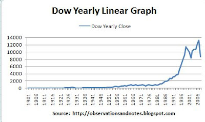
Some of you have noticed that on many of my stock market graphs, the "Y" (i.e., vertical) axis looks a little strange. That's because they are log graphs. Why, for example, is the 100-year stock market chart through 2010 a log graph? The simple answer is that if it was a "normal" (linear) graph it would look something like this....

Dow Jones 100-Year Linear Graph


100 year linear graph of stock market (Dow Index) since 1900
Dow Yearly Linear Graph

Not very enlightening is it? The problem is that, for example, a 100-point move looks the same in 1927 as in 2007 -- that is, you can't see it. A 100-point increase in the Dow from year-end 2007 to year-end 2008 would have been

Sunday, March 8, 2009

Finally, A Little Love From Yahoo!

For a new blogger, one of the fun things is seeing traffic from all over the planet; I've now had visitors from every continent not perpetually covered by snow. Even more rewarding is the increasing attention from readers -- and search engines (without which, there would be few readers).


Speaking of readers.... This has been an historic 7-10 days for Observations' readership. February obliterated the previous monthly traffic record; last week, the daily and weekly records followed suit. Unfortunately, it's a mixed blessing. Because over 75% of my traffic is stock market related, if my traffic is up, it often means that the stock market is down -- a mixed blessing at best!

Google was the first search engine to discover Observations. However, getting discovered is just the start; you want to get ranked on the first page. Still, being ranked by Google is a good thing, even if not on the first page; they handle about 50% of the searches. Therefore, it was especially rewarding when I noticed the search below:


Observations has been at the top Google searches before, but, to my knowledge it' s never held the top TWO spots before.

Yahoo and MSN Live Search have been especially slow to discover Observations. So, I was even more surprised to finally get

Wednesday, March 4, 2009

Dow 25-Year Moving Average History

The chart below shows that the stock market rarely falls very far below its 25-year moving average. As you can see, we are now right at that moving average. On Monday, March 2, 2009 the DJIA -- Dow Jones Industrial Average -- closed at 6763. If we treat that as the 2009 close, the 25-year moving average is 6768.

Dow 25-Year Moving Average Graph


Graph of stock market (Dow Jones Index) 25-year moving average
Dow 25-Year Moving Average
Note: click on the graph to enlarge it. For a more updated version of the above graph, see 2010 End-of Year Stock Market Update100 Years of Stock Market History for the latest 100-year chart w/o moving average.


A Critical Area on the Dow?


To my knowledge, this is not a widely followed metric. In the history of the Dow, I see only four previous periods when we have been in this area:
  • The Great Depression -- the 1932 & 1937 troughs in the graph (For more on this period in stock market history, see 1929-32 Crash Revisited)
  • World War II -- the 1940-43 trough
  • The Vietnam War/ Oil Crisis years culminating in the 1974 trough
  • The high inflation era culminating in the 1981 trough
In the most recent instances, 1974 and 1981, the 25-year moving average provided solid support. In fact, 1981 was the beginning of the greatest bull market in history. However, the support was less firm in 1941, and non-existent in 1932. The obvious question: Is today's environment more akin to 1974 and 1981, or more like the World War II and Great Depression eras?

Stay tuned.

Update
Note: the Dow bottomed 5 days later on March 9, 2009 at 6547.

The moving average closed out 2009 at 6559.

Related Posts

See this post for the most recent update to the 25-year moving average text, not graph.
100 Years of Stock Market History for the latest 100-year chart w/o moving average.
For lists of popular posts and an index of all stock market posts, by subject area, see the sidebar or the menu bar in the blog header.
Last modified 1/4/2013

Monday, March 2, 2009

Dow Price/Earnings (P/E) Ratio History Since 1929

This post graphs the Dow Index normalized price/earnings ratio since 1929, and compares the p/e ratio to overall stock market performance. The charts have been updated to include prices and earnings through year-end 2019.

Yearly Graph of Dow Price Earnings (P/E) Ratios Since 1929


Stock Market (Dow Jones Index) normalized/smoothed price/earnings ratio (p/e) history as of 2020
Dow Normalized P/E Ratio History Since 1929
The chart above (click to enlarge), goes all the way back to 1929; it ends at year-end 2019. What's most striking about this graph is the variability of the price/earnings ratio; the p/e ratio is the price you have to pay for $1 of earnings. This earnings multiple varies from close to 30 all the way down to around seven. And, remember, these are normalized price earnings ratios (the price divided by normalized earnings -- NE). I call this the NPE. If I had used the standard yearly p/e ratio, the variation would be even more dramatic. (As you might guess from just looking at the chart, the average normalized price/earnings ratio is