Sunday, December 26, 2010

Creating a Mini Strategic Plan

Creating mini-strategic plan as alternative to New Year's Resolution


It's getting close to New Year's Resolution Time. As a result, I'm seeing a significant increase in traffic to my Personal Strategic Planning posts. Personally, I think strategic plans are more effective than New Year's resolutions -- partly because they force to you think through not only what you'd like to accomplish, but also why, and  how to go about it. However, my sense is that some people are not yet ready to commit to developing a full-blown personal strategic plan. If you’re one of those people, consider taking less than 30 minutes to do a mini- plan instead.

Creating a Mini-Personal Strategic Plan

The process for creating a mini-personal strategic plan is similar to the process for creating a full-blown plan that I described in my earlier strategic planning posts -- except that it addresses only one of your dreams. In short, you:
  1. Describe your dream (what you want to accomplish - your desired outcome)
  2. Identify your strengths, weaknesses, opportunities & threats (SWOTs) relevant to that dream
  3. Based upon the above, identify the major goals that must be reached in order to realize your dream.
  4. Identify your strategies -- the steps you must take to reach each goal.

The result of those four steps is a plan that takes advantage of your strengths & opportunities, overcomes the identified obstacles (weaknesses & threats), and gets you on the path to realizing your dream. The completed plan displays your dream, the supporting goals and strategies and, where needed, reminders of why each element of the plan is important.  

The outline of a full-blown plan is often formatted as a mind map or like this. However, you can use any format that works for you. Include enough prose so that the reasons why you need to take these actions are crystal clear. In any event, yours will be a lot simpler than those examples since it will only address one dream (e.g., all or part of one section of the diagram).

When you have finished the planning process, you will be able to visualize the goals you need to achieve in order to realize your dream, the steps you need to take to reach each goal, and why each element is important.

If you have trouble with any of the above steps, they are described in more detail in the posts describing the full-blown planning process.
  1. Discovering Your Vision
  2. Identifying Your SWOTs, and
  3. Creating Your Personal Strategic Plan (developing goals & strategies).
You will follow those same steps.  However, for your mini-plan, you'll only worry about one dream. You can do a mini-plan for part or all of any important area of your life – your finances, health, family/social life, career, etc.  Think about it; with just 30 minutes or less of planning you can be well on the way to resolving the most important issue in your life!

Once you finish your mini-plan, see how easy it is and see how useful the results are, I hope you will consider doing a complete personal strategic plan.

Good luck.


Other Personal Strategic Planning Posts

The Core Processes
Discovering Your Vision: Identifying the dreams you want to make come true!
Identifying Strengths, Weaknesses, Opportunities and Threats (SWOTs): the "meat" of the process.
Creating Your Personal Strategic Plan: writing your goals and strategies

Additional Posts
A Career Planning Approach: An approach to doing a mini-plan for your career; this approach is also useful in other areas.
A Sample Personal Strategic Plan: an introduction/overview including examples & sample formats

Copyright © 2010.         Last modified: 12/29/2020

Share This Article

To share via Facebook, Twitter, Pinterest, etc., see below except on mobile devices (where you share in the normal way).

Monday, December 20, 2010

How Much Will a $10,000 Investment Grow to in 10 Years?

What will $10,000 invested in the stock market be worth in 10 years? No one knows. However, the graph below shows the frequency of outcomes in the past. That's the best guide we have to the future. (Note: if you want to know what $10,000 will be worth invested at a fixed rate of return (e.g., in Treasury Notes/Bonds or a CD), or NOT invested, see "Related Posts" at the end.)

This post explores the inherent variability of stock market returns, and especially the impact that variability has on retirement planning. Understanding the risks your retirement plan is subject to is the first step in managing those risks.

Results of Investing $10,000 in the Stock Market: What Will $10,000 be Worth in 10 Years?


Variability of stock market (Dow) Returns over 10 years


The graph above (click on image to expand), shows the historical results of investing $10,000 in the stock market for 10 years. The horizontal axis shows possible values of the portfolio at the end of the 10 years assuming dividends have been reinvested. The lines and bars reflect the frequency of various outcomes for 100 10-year periods beginning year-end 1899. (Note: to calculate ending portfolio values for an initial investment of $1,000, divide by 10. To calculate the results for n thousand dollars, multiply the results for $1,000 by n. For example, for a $100,000 investment, multiply the results for $1,000 by 100.) Following are some questions this chart can help you answer.

How Often Will My Ending Portfolio Be Between, For Example, $5,000 and $10,000(!!)?

Sunday, December 12, 2010

U.S. 10-Year Treasury Note Real Return History

This post graphs the history of "real" (i.e., inflation-adjusted) returns for investors in U.S. Treasury 10-Year Notes beginning in 1900.

100 Years of Treasury Note Interest Rate History documents U.S. interest rates over the past century based upon the rates in effect at the "time of issue" -- the "coupon rate." For buy and hold bond investors, that was also the investor's nominal rate of return.  However, because of inflation, the investor's real return is almost always less than the coupon rate. For short maturities, the investor's return is very close to that coupon rate -- again, assuming he holds to maturity. However, over a 10-year period, inflation can have a significant impact. In this post, we'll evaluate that impact.

10-Year Treasury Note Real Returns: The Impact of Inflation

graph of 10-year T-Bond inflation-adjusted returns (to 2012)
10-Year Treasury Note Real Returns

The above graph uses Robert Shiller's Irrational Exuberance data to approximate the historical "real" returns of investors in 10-year Treasury Notes from 1900 to 2002 (see

Thursday, December 2, 2010

December 2010 Stock Market Update


November, Year-To-Date & Recovery-To-Date Review
Note: click here for December/End-of-year data


After advancing more than 1,000 points in the prior two months, the market set a new 52-week high of 11,444 early in the month, then took a breather. The DJIA (Dow Jones Industrial Average) closed November at 11,006.92.

There is both good news and bad news, depending on your perspective. If you like good news, here's how the November close stacks up against some earlier benchmarks:

  • From 3rd Quarter Close of 10,788: Up 219 points (2.0%)
  • From 2009 Close of 10,428: Up 579 points (5.6%)
  • From Recent Low of 9986 on August 26: Up 1021 points (10.2%)
  • From 52-Week Low of 9686 on

Tuesday, November 30, 2010

Analyzing Treasury Bond Interest Rate History since 1900

The chart below of bond interest rate history has negative implications not just for some bonds, but potentially for stocks & housing as well. This post complements 100 Years of Treasury Note Interest Rate History, the previous post which graphed the month-by-month rates.

Together, the two posts make it clear that we are currently experiencing historically low yields. That suggests a future of rising interest rates. Rising rates have negative implications not only for many bond investors, but potentially for the stock market and housing market as well.

Treasury Bond Interest Rate History: Yearly Frequency Histogram


frequency histogram of 10-year Treasury Note interest rates (yields) for 100 years


The above histogram/frequency distribution of treasury yields is based on the same data as the chart in the previous post (click on image to expand). From 1953 onward, the source data is

Wednesday, November 17, 2010

100 Years of Treasury Bond Interest Rate History

Investors expecting bond funds to perform as well in the next 10 years as they have in the last 10 will be disappointed. Bonds can play an important role in investor portfolios, reducing volatility and increasing the predictability of returns. However, the stellar performance of bond funds -- especially longer-term funds -- as yields have declined over the last 30 years will not be repeated anytime soon. Not only that, there is even the risk of negative returns.

U.S Treasury Bond Interest Rate History Since 1900


100-year history of 10-year Treasury Note interest rates (yields) 1900 - 2013
U.S. Treasury Bond Interest Rate History

The graph above (click on image to expand) shows U.S. interest rates beginning in 1900. From 1953 onward, the rates are

Monday, November 1, 2010

November 2010 Stock Market Update


October, Year-To-Date & Recovery-To-Date Review
Note: click here for November data


The market is on a tear. The DJIA (Dow Jones Industrial Average) closed the month of October at 11,118.49. Partially in anticipation of additional quantitative easing from the Fed, the market continued the advance from its recent low in August. Here's a summary of the extent of the advances:

  • From Prior Month Close of 10788: Up 330 (3.1%)
  • From 2009 Close of 10428: Up 690 points (6.6%)
  • From Recent Low of 9986 on August 26: Up 1133 points (11.3%)
  • From 52-Week Low of 9686 on

Tuesday, October 19, 2010

The Make-Up of 10 Year Stock Market Returns

Analysis of the contribution of dividends, earnings growth and valuation to past returns raises some red flags regarding the next 10 years. Near-all-time-low dividends are providing less protection than dividends have historically provided for investors. In addition, after two decades of steadily increasing p/e ratios, the chances of valuation making a negative contribution to returns appear to be increasing.

Components of 10-Year Stock Market Returns


Earnings, dividends & price/earnings (p/e) contribution to rolling 10-year stock market (Dow) returns
Contribution to 10-Year Stock Market Returns

Above is a graph of 10-year returns of the

Tuesday, October 12, 2010

Retirement Planning: Variability of 20-Year Stock Market Returns, in Dollars

Does your retirement plan assume that you will earn average returns on your investments? If so, your plan may be at risk. This post explains why. It is certainly possible that you will earn average returns. However, that is only one of the possible outcomes -- many of which are significantly worse than average. Unless you have an understanding of the variability of stock market returns, you will likely overestimate the likelihood that your retirement plan will work.

In this post, I am again taking the viewpoint of an investor planning for retirement. We'll assume the same situation we assumed in Don't Plan Retirement Assuming Average Stock Market Returns. That is, we have a 45 year old who wants to retire at age 65. He has received a $100,000 inheritance, and wants to accumulate $670,000 in the 20 years remaining before he retires. It turns out if he receives the average 20-year percentage return in my Dow history database, his ending portfolio will be about $670,000. Do you think if he invests the $100,000 in the stock market at age 45 then all of his retirement planning problems are solved? Think again.

How Much Will Your Stock Investment Grow? What Will $100,000 be Worth Invested in the Stock Market for 20 Years?


How much will your stock investment grow? Variability/ probability of stock market returns/ performance
(Note: if you want to know what $100,000 will be worth invested at a fixed rate of return (e.g., in Treasury Notes/Bonds or a CD), or NOT invested, see footnote.)

The Variability & Distribution of 20-Year Stock Market Results

In Range of Stock Market Returns in Dollars, we looked at the increasing gap between the best and worst outcomes as the holding period went from 10 to 100 years. From the high-low bars in that chart, we saw that

Monday, October 4, 2010

The Importance of Bond Duration

Duration is a way to measure interest rate risk; it is a more precise measure than maturity alone.

The Impact of Duration on Sensitivity to Rate Changes


The graph above demonstrates the impact that duration has on the sensitivity of bond prices to interest rate changes. This post explains how duration is calculated and

Friday, October 1, 2010

October 2010 Stock Market Update

100 Year Dow Chart with 25-Year Moving Average


Dow 25 Year Moving Average

Above is a very long-term chart of the DJIA (Dow Jones Industrial Average), including the 25-year moving average (click chart to expand); it uses this past month's close for this year's close. It shows that the market rarely falls very far below its 25-year moving average.

September, Year-To-Date & Recovery-To-Date Review
Note: click here for October data


In early March 2009, I posted Dow At 25-Year Moving Average. The Dow continued lower for several more days before bottoming at 6547 on March 9 --

Thursday, September 23, 2010

Yield to Maturity (YTM) & Interest Rate Risk

This post introduces YTM, and explains why rising interest rates result in falling bond prices.


Bond Price and YTM/Interest Rates

The above graph summarizes the relationship between the two; the post helps explain why this is so.


Calculating a Bond's Yield to Maturity
In the fundamentals of investment valuation post, we introduced the concept of present value, and arrived at

Wednesday, September 8, 2010

Houston Texans 2010 Kickoff


Texans' 2009 Accomplishments


The Texans finished the 2009 National Football League season with a 9-7 record, and came within a tiebreaker of making their first trip to the playoffs. Along the way, they accumulated some impressive offensive statistics -- for example, number one in passing, and fourth in total yards (league-wide).

After a horrible 0-3 start with the defense giving up an average of over 200 yards/game rushing, the team was 9-4 over the final 13 games. During that 13-game stretch, the Texans were second in the NFL in rushing defense and fourth in overall defense.

Average Offensive/Defensive Rank & Net Yardage Differential

Over the final 13 games, therefore, you could argue that the Texans were

Wednesday, September 1, 2010

September 2010 Stock Market Update

100 Year Dow Chart with 25-Year Moving Average


Dow 25-Year Moving Average

Above is a very long-term chart of the Dow, including the 25-year moving average (click chart to expand); it uses this past month's close for this year's close. It shows that the market rarely falls very far below its 25-year moving average.

August, Year-To-Date & Recovery-To-Date Review
Note: click here for September data


In early March 2009, I posted Dow At 25-Year Moving Average. The Dow continued lower for several more days before bottoming at 6547 on March 9 --

Tuesday, August 24, 2010

Fundamentals of Investment Valuation

As we saw in Bond Basics, a bond typically represents an obligation by the borrower to pay fixed amounts of interest on fixed dates, and to repay the principal amount when the bond matures. The relative certainty of the amounts and dates is the major advantage of bonds compared to other possible investments. Bond valuation, then, is assigning a value or price to this stream of payments.

Intro to Present Value: What is $105 a Year from Now Worth to You Now?

The key to pricing bonds is the concept of Present Value, or PV. Suppose you can earn 5% interest and you have $100. From the bond basics post we know that interest = principal x rate x time. So, in one year $100 will earn ($100 x 5% x 1 =) $5 in interest.

Therefore, a year from now you can have $105 -- your original $100, plus $5 in interest. It is in that sense that the "present value" of $105 a year from now is said to be $100; $105 a year from now is worth $100 today. Note that the

Sunday, August 1, 2010

August 2010 Stock Market Update

100 Year Dow Chart with 25-Year Moving Average

Graph of stock market 25-year moving average
Dow 25-Year Moving Average


Above is a very long-term chart of the Dow, including the 25-year moving average (click chart to expand); it uses this past month's close for this year's close. It shows that the market rarely falls very far below its 25-year moving average.

July, Year-To-Date & Recovery-To-Date Review

Note: click here for August Data

In early March 2009, I posted Dow At 25-Year Moving Average. The Dow continued lower for several more days before bottoming at 6547 on March 9 --

Monday, July 26, 2010

Bond Basics

What Is a Bond?

A bond is a loan. When you buy a bond, you are lending money to the bond's issuer. Generally, the loan is for a fixed amount of money, the principal -- or face amount -- for a fixed length of time. At the end of that time, the bond is mature; the borrower pays off the loan by paying off the face amount. Most often, the loan is at a fixed rate of interest, the interest being due on a fixed schedule during the life of the loan (e.g., quarterly or yearly).

Technically, not all fixed income instruments are bonds. However, in this post I am using the term bond loosely to include not just bonds, but other fixed income instruments such as bills, notes and certificates of deposit as well.

Basic Bond Math: Calculating Interest

Thursday, July 1, 2010

July 2010 Stock Market Update

100 Year Dow Chart with 25-Year Moving Average

Dow 25 year moving average graph
Dow 25 Year Moving Average

Above is a very long-term chart of the Dow, including the 25-year moving average (click chart to expand); it uses this past month's close for this year's close. It shows that the market rarely falls very far below its 25-year moving average.

June, Year-To-Date & Recovery-To-Date Review
Note: click here for July Data


In early March 2009, I posted Dow At 25-Year Moving Average. The Dow continued lower for several more days before bottoming at 6547 on March 9 --

Thursday, June 3, 2010

June 2010 Stock Market Update

100 Year Dow Chart with 25-Year Moving Average


Dow 25-year moving average graph
Dow 25-Year Moving Average
Note: For a more up-to-date version of the above chart see 2010 Year-end Stock Market Update.

Above is a very long-term chart of the Dow, including the 25-year moving average (click chart to expand); it uses this past month's close for this year's close. It shows that the market rarely falls very far below its 25-year moving average.

May, Year-To-Date & Recovery-To-Date Review
Click here for July update with June, 2010 stock market results

In early March 2009, I posted Dow At 25-Year Moving Average. The Dow continued lower for several more days before bottoming at 6547 on March 9 --

Wednesday, May 26, 2010

The Best & Worst 35-Year Returns in Stock Market History

35-Year Rolling Returns

Previously I have published graphs of 5, 10, 20 and 50-year rolling returns. Thirty-five years may seem like a strange choice for an addition to the series. However, I chose 35 years because I thought the results might provide useful benchmarks for those planning for, for example, ages 30-65, 65-100, etc. As always, because we are looking at rolling returns, we will look at not only the best and worst 35-year returns, but at all 35-year returns.

Stock Market Rolling 35-Year Returns Graph

Stock market (Dow) rolling 35-year returns
Dow 35-Year Rolling Returns

Above is a chart of the 35-year total return of the DJIA (Dow Jones Industrial Average) beginning

Tuesday, May 4, 2010

May 2010 Stock Market Update

100 Year Dow Chart with 25-Year Moving Average


Dow 25-Year Moving Average

Above is a very long-term chart of the Dow, including the 25-year moving average (click chart to expand); it uses this past month for this year's close. It shows that the market rarely falls very far below its 25-year moving average. When this graph was originally posted, I noted that the one big exception to the rule was the crash that preceeded the Great Depression.

April, Year-To-Date & Recovery-To-Date Review

In early March 2009, I posted Dow At 25-Year Moving Average. The Dow continued lower for several more days before bottoming at 6547 on March 9 --

Friday, April 30, 2010

A Retirement Income & Spending Plan

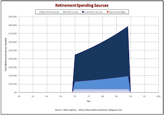
In the early stages of retirement planning, it makes sense to focus on accumulating sufficient assets to retire. However, when you're actually in retirement you'll find that the key is to have enough income each year to support your spending. This post adds the income calculation to the existing retirement model. (See link at the end of this post.)

Retirement Expense Graph

Sources of retirement income to cover expenses
Retirement Spending Sources

The graph above (click to expand) shows the

Sunday, April 4, 2010

April 2010 Stock Market Update

100 Year Stock Market (Dow) Chart with 25-Year Moving Average

Stock market 25-year moving average graph
Dow 25-Year Moving Average
Note: for a more up-to-date version of the above graph, see 2010 Year-End Stock Market Update.

Above is the chart introduced and analyzed in 100 years of stock market (Dow Jones) history -- with the addition of the 25-year moving average (click chart to expand). As before, it begins around 1900; it uses this past month for this year's close. It shows that the market rarely falls very far below its 25-year moving average. When this was originally posted, I noted that the one big exception to the rule was the crash that preceeded the Great Depression. Since February '09, I have been updating this graph approximately once a month.

March, First Quarter/Year-To-Date & Recovery-To-Date Review

In early March 2009, I posted Dow At 25-Year Moving Average. The Dow continued lower for several more days before bottoming at 6547 on March 9 --

Saturday, March 27, 2010

Dow Price/Dividend Ratio and Dividend Yield History (thru 2012)

This post graphs stock market dividend yields since 1900 and shows that they are at historically low levels. Since the price/dividend ratio is the inverse of dividend yield, valuations based upon p/d ratio are at an all-time high. Historically, expensive markets such as these have produced disappointing long-term returns.

I've argued elsewhere that valuation is important -- it is important not to overpay for investments. A common basis for valuation is earnings; investors decide how expensive the market is based upon how much one has to pay for one dollar of earnings -- the price / earnings ratio. In this blog, I refine that a bit and look at normalized price/earnings ratios. (About Normalized P/E Ratios describes my normalization process.) However, this is not the only way to assess valuation. Another popular valuation metric is the price/dividend ratio -- how much must an investor pay for one dollar of dividends (or, conversely, what is the investor's dividend yield)?


100 Years of Stock Market Price/Dividend Ratio History


Graph of 100 year history of stock market (Dow) price/dividend ratio thru 2012
Dow Price/Dividend Ratio History


The above chart (click to expand) shows the 100-year history of

Wednesday, March 10, 2010

The 10-Year Stock Market Projection

This post presents my "official" projected stock market returns for the 10 years beginning in January 2012. It also compares previous 10-year projections with the actual results.

Note: I do this "formal" projection once a year when earnings are published.  For the most recent informal (& text-only) monthly update, see March, 2013 Stock Market Performance 


Projected 10-Year Stock Market Returns

Stock market (Dow Jones Index) forecast for next 10 Years performance /returns
Projected Dow 10-Year Returns

The above graph (click to expand) shows my projected returns for the DJIA (Dow Jones Industrial Average) for the twelve 10-year periods beginning end-of-year 2000 through end-of-year 2011. The blue dashed line shows the returns that I estimated that a hypothetical investor in the stock market would receive over the next ten years 

Tuesday, March 2, 2010

March 2010 Stock Market Update

100 Year Stock Market (Dow) Chart with 25-Year Moving Average


Stock market 25-year moving average graph


Above is the chart introduced and analyzed in 100 years of stock market (Dow Jones) history -- with the addition of

Friday, February 19, 2010

Houston Rockets at All-Star Break

The all-star break is a good time to review the Rockets' statistics. Early in the season would have been too early as the team was still in transition -- trying to redefine itself in the absence of both Yao Ming and Tracy McGrady. When I look at basketball stats, I prefer to analyze them on a per-minute, or per-40-minutes, basis. The three traditional stats -- points, rebounds and assists -- are presented on that basis in the table below for the Rockets' key, "rotation," players. (click to enlarge the table)

Houston Rockets 2009-2010 Production per 40 Minutes Played


Houston Rockets Per Minute Statistics

Houston Rockets Per Minute Statistics

Carl Landry Tops in Production
Interestingly, the number one and two scorers,

Wednesday, February 10, 2010

Earnings & Dividends Determine Long-Term Stock Market Returns

In the long term, the contribution of earnings growth and dividends to total return dominates the contribution made by changes in p/e ratio.  We saw in an earlier post that changes in the price/earnings (p/e) ratio had a disproportionate impact on yearly stock market returns. In this post, we will see that over time earnings growth and dividends win out.

The Contribution of Earnings Growth and Dividends to 50-Year Stock Market (Dow) Total Returns


Contribution to 50-Year Stock Market Returns

The stacked bar chart above (click to expand) shows the market's annualized total return for 50-year periods beginning in 1920; the segments of the bar show

Monday, February 1, 2010

How the Stock Market Projection Model Works

Is it possible to forecast the stock market return for the next 10 years? If so, how do you do it? In Projecting Stock Market Returns we saw the results of a simple forecasting model that seemed to produce promising results. Below is the resulting graph introduced and discussed in that post (click to expand). In this post, I'll describe how the model estimates future returns.

Projecting 10-Year Stock Market (Dow) Returns

Stock market (Dow Index) 10-year forecast returns vs actual performance

Stock Market (DJIA) Forecast Methodology


We have consistently seen evidence that

Saturday, January 30, 2010

Investing: Subject Index

TABLE OF CONTENTS


INVESTING-GENERAL, BONDS & INFLATION


Inflation

The Declining Value of a Dollar: 100 Year History: Shows the dramatic decrease in purchasing power over time.
Inflation Calculator: Calculates inflation rate between any two years. Converts current dollars to/from prior years.
What Would $10,000 in 19xx be Equivalent to Today? graph to convert dollar amounts from any prior year to their approximate equivalent today.
How Much Will $100 be Worth in 10-20 Years? converts today's dollars to equivalent in future years.
100 Years of Inflation History: graph, + summary of impact of inflation on bonds, stocks, housing....
Inflation Calculator/Spreadsheet: calculates inflation rate and change in purchasing power between any two years -- e.g., between 1970 & 1980.

Tuesday, January 26, 2010

Projecting Stock Market Returns

What if We Could Predict Future Stock Market Returns?


Imagine that we could forecast whether our returns were going to be high, or low, before we invested. Imagine that we had an early warning system that warned us about upcoming bear markets or stock market crashes, and gave us a gentle heads-up when a bull market was imminent. This post is a step in that direction.

One important reason for doing analysis is to get insights that help us plan better. In the best cases, analysis results in an understanding so deep that you can predict the future -- or at least come very close under certain conditions. The obvious question is, can we use the results of the stock market analysis in the previous posts to help us make useful forecasts and plan our investments better? The graph below (click to expand) argues that we can.

Projecting 10-Year Stock Market (Dow) Returns

Stock market (Dow Index) 10-year forecast returns vs actual performance

In the graph above, each point on the solid blue line represents

Monday, January 11, 2010

Retirement Planning: The Distribution/Variability of 10-Year Returns

Another Look at the Risks of Planning Retirement Based Upon Average Stock Market Returns


In a recent post we reviewed the range/variability of stock market results over 20-year periods, and the likelihood market returns would fall above or below specific values. For example, how often have returns fallen below 6%? In this post, we'll do the same with 10-year returns.

Note: If you find the chart below difficult to digest, see the presentation in this post first

Historical Results of Investing in the Stock Market for 10 Years


Stock market 10-year performance showing variability & Dow return percentiles (probability distribution)
Retirement Savings: Distribution/Variability of 10-Year Returns


The graph above (click to expand), illustrates the

Friday, January 8, 2010

Graph Graveyard

I plan to update some of my graphs annually.  At least for now, I'll keep old versions here -- otherwise I'm concerned I will have a bunch of inbound links from elsewhere on the internet that don't have anywhere to go.