Tuesday, April 28, 2009

The Best & Worst 5 (and 50) Year Returns in Stock Market History

In recent posts, we've looked at intermediate-term stock market performance -- in particular, returns over 10 & 20-year periods. In this post, at the request of a reader (John W), we'll look at 5-year returns. I'm not sure what to call five years; to me, it's not really a long enough period to consider intermediate term, but too long to call short-term. In any event, we'll again look at rolling returns beginning around 1900.
(Note: This post covers returns through year-end 2008; for the most recent 5-year return, see this post.)

"Rolling" 5-Year Stock Market (Dow) Returns Graph


100 year stock market (Dow) history: rolling 5-year returns
Dow 5-Year Rolling Returns

Above is a chart of the five-year total return of the DJIA (Dow Jones Industrial Average) beginning around 1900. Each point on the graph represents the average annual return earned by an investor who bought the Dow at that year-end and sold 5 years later, reinvesting dividends in the interim. For example, the first point on the graph shows that an investor who bought at year-end 1901, reinvested dividends annually, and sold at year-end 1906 earned approximately 13% per year. As always, I've had to estimate the dividends prior to 1929.

The Best & Worst 5-Year Returns in History


As usual, the worst return (-16.4% per year) resulted from buying before the 1929 crash -- 1927 in this case, rather than our usual 1928. (Note: for more on the 1929 crash, see this post.) Also as usual, the best returns were the result of, in effect, selling near the top of a bubble. Buying in 1923 and selling in 1928 earned a 30.7% 5-year return; buying in 1994 and selling in 1999 earned a 26.8% return. Finally, again as usual, the average return was 10%.  (Note: For a very different way of looking at the best and worst five year returns, see Range of Stock Market Returns from 1-10 Years in Dollars.)

Observations & Questions


Not surprisingly, the best 5-year return is better than the best 10-year return, but not as good as the best 1-year return. The worst 5-year return is worse than the worst 10-year return, but not as bad as the worst 1-year return. In addition, while I don't think the cyclicality of the 5-year returns is as pronounced as the 10-year returns, it's clearly more than is visible in the 1-year returns. And, that starts me down a whole new path.

We've been looking at the rolling returns to see what we can learn from them individually. However, there is clearly some kind of a pattern developing if we think of them as a series. For instance, you might ask, as you go from 2-year rolling returns to, say, 100-year rolling returns, what happens to the range of returns? When does the cyclicality start? When does it end? And, what's causing it??

John, thanks for encouraging me to continue this line of inquiry. As a first step, let's take a look at a longer-term rolling return.

Dow 50-Year "Rolling" Stock Market Returns Chart
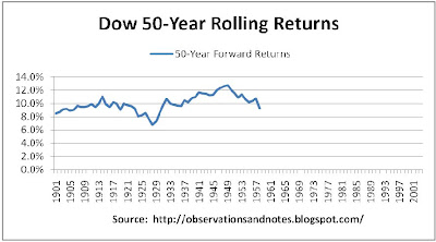


100 year stock market (Dow) history: rolling 50-year returns
Dow 50-Year Returns

The winner is (drum roll please) 1949, with a 12.8% annual return for the next 50 years -- at least partly because, 50 years from 1949 is ... 1999. And, the loser is (another drum roll) 1928, again, with a 6.8% annual return -- for the next 50 years. (Note: The average return was again 10%.) Remember, these are nominal returns, so assuming inflation averaged around 3%, the real return from 1928 was 3.8%. (For more on nominal vs real returns, see this post). As we have seen (e.g., in Stock Market Yearly Returns), investing in the stock market for 50 years exposes you to substantial year-to-year risk. Seems like a lot of risk, and for a lot of years, for less than 4% real return....

I have no idea how you know when you're 50 years before a bubble peaks so that you can buy. But, maybe we have a hope of figuring out when we're already at or near a peak so that we can at least consider not buying.

Let's keep digging.


Note: The above charts are based on DJIA (Dow Jones Industrial Average) data from my Stock Market Analysis Model. Results would be essentially the same if we used S&P 500 data.  Dow dividends prior to 1929 have been estimated using another stock market index.

Related Posts:

See the sidebar to the left for an index of all stock market posts, by subject area -- including:
Why Investing in the Stock Market for Less Than 5 Years is Risky: A look at the distribution of the 5-year returns, in dollars.
Range of Returns for 1 to 100-Year Holding Periods graph of best & worst past returns for 1,2,3 ... 100-year periods.
Earnings, Dividends Determine 50-Year Returns: decomposing 50-year returns into return contributed by earnings growth, dividends, change in p/e.
Range of Returns in Dollars for 10-100 Years for a very different look at 50 year returns.
The Best & Worst Years in Stock Market History: 1-year returns
The Best & Worst 10 Years in Stock Market History
The Best & Worst 20 Years in Stock Market History
Rolling 35-Year Returns
Projecting Stock Market Returns

Last modified 8/9/2011
Thursday, April 23, 2009

About Nominal & Real Rates of Return

Nominal Rates of Return


The nominal rate of return is the return that you see most often in the news; most published rates of return are "nominal" rates of return. This is true whether they are stock, or bond returns. For example, if you pay $100 for a CD that will pay you back your $100 plus $5 in interest one year from now, the interest rate is quoted as (5/100=) 5%. Similarly, if you invest $100 in mutual fund XYZ on January 1 and a year later those shares are worth $105, the return on that fund is also 5%. If, in addition, the fund pays you $3 in dividends at the end of the year, the total return will be quoted as ((5+3)/100=) 8%. As an example, here is a graph of stock market nominal return history by year.

While nominal rates of return are "the standard," they can be somewhat misleading -- especially when looking at returns over many years. That's because they ignore the impact of inflation.

Real Rates of Return


"Real" rates of return reflect the impact of inflation. If inflation is 3% per year, then a year from now it will cost $103 to buy what we can buy now for $100. In that case, if we have a $100 investment that earns 3% in nominal terms, a year from now it will represent the same purchasing power as it does today, but no more. That's because goods that you could buy now for $100 will cost you $103 a year from now. In that case, the "real" return is (3% nominal return on investment, minus 3% lost to inflation=) 0%. So, in our examples above, the real return on the CD is (5% - 3%=) 2%; the real total return on XYZ is (8% - 3%=) 5%.

In this blog, returns are always nominal returns -- unless otherwise stated. I call real rates either "real," or "inflation-adjusted."  For example, here's a graph of 10-year Treasury Note Real Returns compared to nominal returns. If I'm looking at long-term nominal returns, I mentally subtract about 3% per year in order to approximate the real rate of return.

Some Implications


It is often important to look at real rates of return when comparing rates of return during different eras. For example, a 12% 1-year CD when inflation was 14% per year, say, during the early 1980's, gave you a real return of (12% - 14%=) -2% -- i.e., you lost 2% of your purchasing power. On the other hand, a 3% CD when inflation is 1% has a (3% - 1%=) 2% real rate of return. The 3% CD is actually a better deal than the 12% CD was!

It's especially important to consider inflation when looking at performance over a long period of time. For example, a $100,000 house purchased 24 years ago and now worth $200,000 has had nominal price appreciation of 3% -- and, assuming inflation has averaged 3%, a real appreciation of 0%. At three percent inflation, prices double approximately every 24 years. Note that this also means that, for example, over a period of 24 years, the purchasing power of a $2,000/month pension would fall to the equivalent of about $1,000/month. Therefore, when doing retirement planning it is critical that you either use real rates of return, or adjust your future income and expenses for inflation.

Related Posts

100 Years of U.S. Inflation History: includes o'view of impact on major asset classes.
100 Years of Inflation-Adjusted Stock Market History: Closing prices adjusted for inflation

Last modified: 3/25/2011

Monday, April 20, 2009

More Houston Rockets "Per-Minute" Statistics

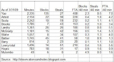
In a previous post, we looked at the most frequently reported Houston Rockets statistics -- points, rebounds, and assists. In this post, let's look at blocks, steals and free throw attempts -- an important, but underappreciated statistic, for reasons that I will explain. While the National Basketball Association (NBA) normally reports these as season-to-date and per-games-played totals, I prefer to look at them on a per-minute, or per 40 minutes of playing time, basis.

Blocks per 40 Minutes of Playing Time


The top 3 are Dikembe Mutombo (4.9 blocks per 40 minutes of playing time), Yao Ming (2.3), and Shane Battier (1.0). Deke leading the way is, of course, no surprise; he's one of the best shot-blockers in the history of the game. However, his 4.9 is probably artificially high because he played so few minutes; the prior two years, he was right around 3.

The surprise here, for some anyway, is Shane -- and this was an off year for him. My sense is that it took him more than half the season to fully recover from his off-season surgery; otherwise, his number might have been closer to the 1.4 he had last year. Another surprise, for some, is the under-appreciated Chuck Hayes, with 0.9. Landry was close behind with 0.8 -- a big increase over last year's 0.4.

Steals per 40 Minutes of Playing Time


The top 3 are Ron Artest (1.8 steals per 40 minutes of playing time), followed by Chuck Hayes and Kyle Lowry (tied at 1.4). No one should be surprised to see Artest in first place. But, here's the "Chuck Wagon" again excelling at defense -- in this case, because he has quick hands. Note: I'm trying to get a good read on Lowry's game, so I'm using his full season totals -- i.e., I'm including his games with Memphis.

Free Throw Attempts per 40 Minutes of Playing Time


The top 3 are Yao Ming (7.0 free throw attempts per 40 minutes of playing time), Kyle Lowry (5.6), and Carl Landry (5.5). I wouldn't have been surprised if Yao's number was higher. In fact, you could argue it should have been higher. For reference, take a look at Shaq (9.2) and Dwight Howard (12.0)!

I'm using free throw attempts to approximate the number I'd really like to see -- fouls drawn. (If anyone knows where I can get fouls drawn please let me know.) It's an under-reported and under-appreciated stat. Drawing fouls is important not only because you get free throws (sometimes), but also because:
  • You get the opposing team closer to its limit for the quarter -- so, you're increasing the number of foul shots, and points, your team will get later in the game.
  • You get the opposing player closer to his limit for the game. If he's a starter, and he fouls out, he'll be replaced by a less accomplished player -- which generally means fewer points for the opposition, or more points for your team, or both. More likely, he won't foul out. However, you've still increased the probability that you will be able to get that player in foul trouble and force his coach to play him fewer minutes. Again, a less accomplished player will replace him. Finally, you've increased the probability that, in order to avoid another foul, he'll play less aggressive defense -- which increases the probability that your team will score. It's most obvious when you see a good shot blocker not even attempt to block a shot because he can't afford to take the chance of another foul.

Rockets fans have seen the impact of fouls demonstrated many times -- especially in Yao's early years. How many times have we lost a game because foul trouble limited Yao's minutes?

One of the reasons I'm so fond of Kyle Lowry is because of his ability to draw fouls. Don't misunderstand, I'm a big "AB" fan as well -- he and Kyle are just very different point guards. Having both may well turn out to be a significant plus for the Rockets during this year's NBA playoffs. This is another example of the depth and flexibility that the GM, Daryl Morey, is building into this team, as I mentioned in my season kickoff post. Tracking free throw attempts allows you to "guesstimate" how many fouls a player draws on the offensive end -- but not on the defensive end. Looking only at free throw attempts, Shane Battier and Chuck Hayes come in 10th and 12th on the team. That obviously significantly underestimates the contribution that those two make drawing fouls.

I'll try to do at least one more post in this series in the next couple of weeks -- as long as the Rockets are still playing....

For more detail on the above stats, see below.

Houston Rockets 2008-2009 Production per 40 Minutes Played


The table below (click to enlarge) shows the Rockets' results per 40 minutes of playing time for blocks, steals, and free throw attempts. For example, I divide a player's total blocks by his number of minutes played to get blocks per minute, and multiply that result by 40 to approximate his results for a full game (players rarely play a full 48 minutes). Note: I've omitted Brian Cook, Joey Dorsey and James White; they didn't play enough minutes to yield reliable results.

Houston Rockets "Per Minute" Statistics
Houston Rockets statistics (blocks, steals, free-throws per minute

Related Material:

Houston Rockets "Per-Minute" Statistics
Houston Rockets: Is it Time Yet?
Houston Rockets "Total" Production Per-Minute
The source of my data is NBA.COM

Last modified 3/12/2010

Friday, April 17, 2009

Houston Rockets "Per-Minute" Statistics

Another Way of Looking at NBA Individual Statistics


Since we're headed into the National Basketball Association (NBA) playoffs, it is a good time to look back at some regular season statistics. I'm not crazy about the way the NBA publishes individual statistics. They generally just show you the totals; I prefer to look at production per-minute, or production per 40 minutes played. This helps me adjust for the significant differences in minutes played -- especially by starters vs bench players. In this post, I'll identify the top 3 Rockets in points, rebounds and assists per 40 minutes played. Yao is the top scorer and rebounder no matter how you look at it; beyond that, you may find a few surprises.

Points per 40 Minutes of Playing Time


The top 3 are: Yao Ming (23.5 points per 40 minutes), Von Wafer (19.7), and Ron Artest (19.2). McGrady was 4th at 18.5; however, if he had been healthy, he would likely have been closer to his 2008 number, 24.1, which would have put him in first place.

The surprise here, of course, is Von Wafer. I liked him a lot in pre-season, but thought it was a toss-up between keeping Von and keeping D.J. Strawberry (maybe because I'm a reformed NY Mets fan??). He seemed like such an unimportant addition to the team that he didn't even get a mention in my season kickoff post. These numbers tell you why the fans have fallen in love with him. Unfortunately, basketball is about more than scoring. However, if he can continue to improve the rest of his game, this will go down as another great move by GM Daryl Morey. Anyway, though Von is around 7th in total points, in my book he's clearly the 2nd most productive scorer. (I say clearly, even though he only has a half-point margin over Artest, because I strongly suspect that his stats for the last couple of months are significantly better than his early season stats. Wish I had the numbers to prove that, but I don't.)

Rebounds per 40 Minutes of Playing Time


The top 4 are: Yao Ming (11.7 rebounds per 40 minutes of playing time), Luis Scola (11.6), and Chuck Hayes & Dikembe Mutombo (tied at 11.4).

Yao, of course, is no surprise. It may be a surprise to some that Scola and Hayes are so close to him in production. Now that Scola is more acclimated to the NBA, his production has increased. His number last year was 9.9; that's a significant change. Chuck Hayes will also be a surprise to some. The "Chuck Wagon" is a very accomplished defensive player -- I just wish we could get a little more offense out of him. In my mind, Deke is clearly the best rebounder on the team. I suspect that, even at his age, had he played more, his results would have been closer to his 2008 number of 12.7 -- which would have put him in first place. Absent injuries, Carl Landry would likely have been in this discussion as well; last year, his 12.0 average was second only to Mutombo's.

Assists per 40 Minutes of Playing Time


The top 3 are: Kyle Lowry (6.6 assists per 40 minutes of playing time), Tracy McGrady (5.9), and Aaron Brooks (4.9). If "Skip" Alston were still with the team, he probably would be in first place, given his 6.7 average last year. And, if McGrady had been healthy, he might have been closer to his 2008 average of 6.3. The surprise, to some, is Kyle Lowry. In my view, Kyle is more of a "pure" point guard than Brooks; these numbers reflect that.

More Houston Rockets "Per-Minute" Statistics discusses blocks, steals and free throw attempts. I think "free throw attempts" are an important, but underappreciated, stat -- for reasons that I explain in that post.

For a little more detail on the above stats, see below.

Houston Rockets 2008-2009 Production Per 40 Minutes Played


The table below shows these key Rockets stats per 40 minutes played (click to enlarge). For example, a player's total points are divided by his minutes played to get points per minute, and that result multiplied by 40 to approximate the results for a full game. These stats are through the end of March. However, the results at the end of the season would be almost exactly the same. One advantage of looking at the stats this way is that they don't change very much from week to week or month to month; in fact, for established players they're quite consistent from year to year. For example, early in Yao Ming's career, when many were still questioning his skills (e.g., Charles Barkley), in my view he was consistently putting up close to 20 "ppg" and 10 "rpg" stats. The problem was he couldn't stay on the floor because of foul trouble and lack of stamina.

I've omitted Brian Cook, Joey Dorsey and James White since the've played so few minutes. On the other hand, I've included Dikembe Mutombo because he's a veteran with a track record, and could conceivable play an important role in the playoffs.

Houston Rockets statistics (points, rebounds & assists per minute
Houston Rockets "Per Minute" Statistics

Related Stuff:

Houston Rockets: Is it Time Yet?
Houston Rockets' "Total" Production Per Minute
The 10 Best NBA Players Ever looks at this same data for some all-time greats.
The source of my data is NBA.COM

Last modified 3/10/2010

Monday, April 13, 2009

Best & Worst 20-Year Returns in Stock Market History

20-Year Rolling Returns

This post graphs not only the best and worst 20-years in stock market history, but returns for all 20-year periods for the last 100 years or more; these are so-called rolling 20-year returns.
(Note: This post covers returns through year-end 2008; for the most recent 20-year return, see this post.)

In a recent post we looked at a graph of yearly stock market performance since 1929; it appears to be completely erratic. Yearly returns varied from gains of close to 75% to losses of almost 50%, with no apparent rhyme or reason. We then looked at stock market rolling 10-year returns. The range of returns was dramatically smaller, roughly 0-20%, and much less erratic. What happens if we look at twenty to twenty-five year stock market returns?

Stock Market "Rolling" 20-Year Returns Graph

100 years of stock market (Dow) rolling 20-year returns (since 1900)
Dow 20-Year Rolling Returns
Above is a chart of the 20-year total return of the DJIA (Dow Jones Industrial Average) beginning around 1900. (Click on graph to expand it.) Each point on the graph represents the average annual return earned by an investor who bought the Dow at that year-end and sold 20 years later, reinvesting dividends in the interim. For example, the first point on the graph shows that an investor who bought at year-end 1901, reinvested dividends annually, and sold at year-end 1921 earned 7.1% per year. Note that the returns prior to 1929 are estimated (I have accurate closing prices, but have estimated the dividends based upon another market index).

As you might have expected, the maximum 20-year annual return is somewhat less than the maximum 10-year return -- 18% compared to 19.5%. The difference in minimum returns is somewhat larger; the minimum 20-year return was 2.5% compared to the worst-case 10-year loss of 1.3%.

The Best and Worst 20-Year Returns in Dow Jones History (since 1900)

What were the best and worst 20-year periods to own stocks? Well, if you bought in:
  • 1941: the return was about 15% per year for the next 20 years, or
  • 1979: 18% annual return

The worst years to buy were:
  • 1928: the return was about 2.5% for the next 20 years
  • 1958, 59 & 61: about 5-5.5% annual return

Average Returns, and the Impact of Start/End Years

On average, 20-year returns were the same as 10-year returns -- around 10% per year. But again the start year had a significant impact -- as much as 10% per year or more. It's worth noting that, whether you're looking at a chart of returns over 10-year periods or over 20-year periods, 1928 is at the bottom of the pile. The obvious reason is that those investors had the great misfortune of starting just before the 1929-1932 stock market crash.

Similarly, 10 or 20-year periods ending close to 1999 are near the top. Ten-year returns appeared to cycle between 0% and 20%. Twenty-year returns exhibit a similar, but more muted, cyclicality. However, unlike the 10-year returns, they appear to have a slight upward slope. That might be interesting to look into further at some point since it's somewhat counterintuitive.

A Better Way to Look at Stock Market Returns -- Especially for Retirement Planning

Since the 20-year returns are cycling up and down, it should be clear that you cannot count on receiving the average returns -- even over periods as long as 20 years (say, from age 45 to 65, or 65 to 85).  What if the market returns only 6% for the next 20 years instead of 10%? What are the chances of that? What impact would it have on your retirement portfolio? To get perspective, it's useful to look at What Will a $100,000 Investment be Worth in 20 Years? (showing the variability of the returns in dollars) or the distribution of 20-year market returns.

Finally, it's important to remember that the impact of expenses has not been included, and, in addition, these are nominal returns, not "real" (i.e. inflation-adjusted) returns. In the real world, expenses usually significantly reduce theoretical "market" returns. And, the real world experiences inflation. If you assume 3% inflation, the 2.5% nominal return for 1928 turns into a 0.5% loss in real terms, and the 5-5.5% nominal returns become 2-2.5% returns -- for 20 years. (For a more detailed discussion of nominal vs real rates of return, see this post.)

Twenty years of negative, or barely positive real returns is not what most people expect. It could be a very serious problem, especially if the 20 years start the year you retire....  And, if your expenses subtract another 2% per year (not unusual for a mutual fund investor).... Well, you get the idea.


Note: The above charts are based on DJIA (Dow Jones Industrial Average) data from my Stock Market Analysis Model. Results would be essentially the same if we used S&P 500 data. Dividends prior to 1929 have been estimated based upon another stock market index.

Other Related Posts:

10-Year Rolling Returns: Similar to this post.
20-Year Rolling Returns vs P/E Ratio also graphs p/e ratio at beginning of each 20-year period.
Best & Worst Returns in DOLLARS: 10-100 Years.  To see the range of returns in $$ -- another important perspective.
The 30 Best & Worst Years in Stock Market History: 1-year returns.
35-Year Rolling Returns, and Stock Market Rolling 5 (and 50) Year Returns Graphs
Range of Returns for 1 to 100-Year Holding Periods Best & worst returns for 1, 2, 3, ... 100 years.
Stock Market Compound Growth Calculator: Calculates growth/return rate between any 2 years -- e.g., between 1974 and 1999.
For a list of other popular posts and an index of stock market posts by subject area, see the sidebar to the left.

Share This Article

Delicious
Bookmark this on Delicious
See the "Share" option in the Menu Bar at the top of the page to share via Facebook, Twitter, etc.
Copyright © 2009. Last modified 11/5/2011

Monday, April 6, 2009

Best & Worst 10-Year Returns in Stock Market History (thru 2012)

10-Year Rolling Returns (Decade Returns)

This post graphs not only the best and worst decades in stock market history, but returns for all 10-year periods since around 1900; these are so-called 10-year rolling returns.

Stock Market "Rolling" 10-Year Returns Graph

stock market (Dow Jones Index) 10-year rolling returns; best & worst performance thru 2012
Dow 10-Year Rolling Returns

Above is a graph of the 10-year total return of the DJIA (Dow Jones Industrial Average) beginning around 1900. (Note: Click on graph to expand it.) Each point on the graph represents the average annual return earned by a hypothetical investor who bought the Dow at that year-end and sold 10 years later, reinvesting dividends in the interim. For example, the first point on the graph shows that an investor who bought at year-end 1900, reinvested dividends annually, and sold at year-end 1910 earned 6.8% per year. Note that the returns prior to 1929 are estimated (which is why I sometimes omit them).

Stock Market Returns for a Decade are Cyclical, and Can be Negative

This is the same data as was used for the 10-year return histogram in the Stock Market Yearly Returns since 1929 post. However, this presentation gives us a significantly different impression. The histogram left us with the impression that 10-year returns have been consistently between 0% and 20%, and much less variable than yearly returns. That's true. However, that presentation was incomplete because:
  • It completely hides the cyclicality.
  • It started in 1929 and missed the fact that 10-year returns can in fact be negative (a key reason why I started in 1901 for this post)
  • It wasn't as clear how often returns are almost zero

Note: This is another example of the boom and bust nature of the stock market alluded to in the discussion of the graph in 100 Years of Stock Market History.

The Best and Worst 10-Year Returns in Dow Jones History (since 1900)

So, what were the best & worst 10-year periods to own stocks? That is, in hindsight, when would have been the best and worst years to buy?

The best 10-year periods to own stocks were the years beginning in:
  • 1918: the return was about 19.5% per year for the next 10 years
  • 1948 & 49: 18.5% annual return
  • 1987 & 88: about 18.5% annual return
The worst years to buy were:
  • 1922: the return was 0.4% per year for the next 10 years
  • 1928: -1.3% annual return -- the only 10-year loss in my data; 1927 & 1929 were both just barely positive. All because of the 1929-1932 stock market crash.
  • 1964: annual return of 0.3%
Note: FYI, the decades ending in 2008 and 2009 didn't make the above list, but they're next. The decade ending in 2009 is 6th at 1.3%; 2008 is 7th at 1.7%. For the most recent 10 years, ending 2012, the return was 7.2%.


Average Returns for a Decade, and the Impact of Inflation & Expenses

On average, stock market returns for a decade were around 10% per year. However, the 10-year returns varied considerably, depending on your "start year."

The graph shows several instances of near-zero 10-year returns. To my way of thinking, a decade is a long time to go with essentially no return on your investment. In addition, there were a number of 10-year periods with returns of 5% or less. Remember, these returns have not been adjusted for inflation. If you assume that over this period inflation has averaged about 3% per year, then the less than 5% nominal returns become less than 2% in real terms, and the near-zero returns become negative. (For a more detailed discussion of nominal vs real rates of return, see this post.)

Equally important, as always, these are theoretical returns -- they ignore the real world impact that expenses such as commissions, fees and taxes have on investors' investment returns.

A Better Way to Look at Stock Market Returns -- Especially for Retirement Planning

The graph above should make it clear that investors don't always get average returns! Sometimes returns are above average; sometimes returns are below average.  What if the market returns only 5 or 6% in the next 10 years instead of 10%? What are the chances of that? What impact would that have on your retirement portfolio? See What Will a $10,000 Stock Market Investment be Worth in 10 Years?. You may be surprised.

Related Posts:

What's Causing the Cycles (variation in returns)?
10-Year Rolling Returns vs P/E Ratio: The above graph with addition of the P/E ratio at the beginning of each 10-year period.
Starting P/E Ratio vs. 10-Year Returns: Shows the 10-year returns that resulted from each initial P/E ratio. The classic way to investigate causation.
Components of 10-Year Returns: Breaks out how much of each 10-year return came from a) dividends, b) earnings growth and c) change in valuation.
How the Stock Market Projection Model Works using this information to project returns for the next 10 years.

Other Best & Worst Returns
Range of Returns for 1 to 100-Year Holding Periods the best & worst returns (only) for 1, 2, 3,... 100 years.
The 25 Best & Worst Single Years in Stock Market History: 1-year returns.
Stock Market 20-Year Rolling Returns Graph same as this post, but for 20 years.
35-Year Rolling Returns Graph, and Rolling 5 (and 50) Year Returns Graphs
Stock Market Compound Growth Calculator: Calculates growth/return rate between any 2 prior years -- e.g., between 1974 and 1999.
Range of Results in Dollars for 10-100 Years: the variability in the sizes of the ending portfolios is surprising.
For a list of other popular posts and an index of stock market posts by subject area, see the sidebar on the left or the blog header at the top of the page.

Note: The above charts are based on DJIA (Dow Jones Industrial Average) data from my Stock Market Analysis Spreadsheet/Model. If you have trouble downloading the Excel spreadsheet, see this post. Results would be essentially the same if we used S&P 500 data. Dividends prior to 1929 have been estimated based upon another stock market index.

Share This Article

Delicious
Bookmark this on Delicious
To share via Facebook, Twitter, etc., see below.
Copyright © 2009.                       Last updated 1/22/2013

Archives

Wednesday, April 1, 2009

Stock Market Annual Performance since 1929 (bar chart)

(Last updated Sept 2020)
In this post, we graph total stock market returns by year -- going all the way back to 1929. Total return includes dividend income as well as capital appreciation; the previous post in the stock market performance history series considered only closing prices/ capital appreciation. (Note: if you are especially interested in 1929-32, see The 1929 Crash.)

Dow Index Annual Performance Graph: 1929 - 2019


DJIA (Dow Jones Index) long-term annual stock market performance 1929 - 2019
Dow Yearly Total Return 1929 - 2019

The bar chart above (click on image to enlarge it) shows the DJIA (Dow Jones Industrial Average) total yearly return for close to 100 years. (To see a stacked bar chart showing the contribution that earnings growth, dividends, etc. made, by year, see The Extraordinary Impact of P/E Ratios.) A regular line graph gives you little sense of the year-to-year performance; I think the bar/column chart works much better. What can we learn from this graph? Initially, about all I could conclude from this extensive performance history was: