Monday, December 28, 2009

A Career Planning Approach

An approach to career planning

An Approach to Career Planning

(Last updated October 2020)
Developing a career plan can be a good way to get comfortable with the personal strategic planning process. For one thing, many people already have a clear picture of their "dream" job (the job they would like to have 5-10, even 15 years from now) - so, the first step in the planning process has already been completed. For another, many people will find that some very useful work has already been done for them!

The approach presented here builds upon the process summarized in this overview of personal strategic planning.  The primary steps in that process are covered in more detail in:
If you are not familiar with this process, I suggest you review the above posts before developing your career plan.

What are the Requirements? A Useful Intermediate Step

Here's a useful step not included in the basic personal strategic planning process presented above.  After you have decided on your dream job, but before you start brainstorming your SWOTs, take the time to

Tuesday, December 15, 2009

Don't Plan Retirement Assuming Average Stock Market Returns

Planning Your Retirement Assuming Average Stock Market Returns is Risky

In a recent post I warned that developing your retirement plan based solely upon the advertised average stock market returns may be hazardous to your financial health. When using a traditional retirement planning calculator, I consider not only the average but also the range of past outcomes, and the distribution/variability of returns between the best and worst outcomes.

Note: If you find the chart below difficult to digest, see the presentation in this post first.

Historical Results of Investing in the Stock Market for 20 Years


Graph of stock market (Dow) return variability: percentiles (probability))
Retirement Savings: Distribution of 20-Year Returns

In the chart above (click on it to expand), we revisit the situation introduced in the previous post -- you receive a $100,000 inheritance at age 45 and plan to retire at age 65. (Note: to calculate results of a $10,000 inheritance, divide by 10.) The point of the chart is to give you a better feel for your potential results based upon the historical results in my database of DJIA (Dow Jones Industrial Average) stock market returns over the past 100 years or so. The interpretation of the "lines" is as follows:

Wednesday, December 2, 2009

Implications of Stock Market Dollar Returns on Retirement Planning

Counting on Average Market Returns May be Hazardous to Your Health

Does your retirement plan assume you will earn average returns on your stock market investments? Are you assuming that because over the long run market returns don't seem to vary much from the average you are safe counting on average returns? If you assume average returns, you are going to be disappointed much of the time -- possibly dangerously disappointed. The average is a good place to start your analysis. However, in this post I hope to convince you that it's not a good place to stop.

In a post in May, we saw that for a theoretical buy and hold investor, the longer the holding period the closer the annual return converged on the long-term average stock market return of around 10% per year. However, in a recent post we saw that while the annualized percentage returns converge with time, stock market dollar returns diverge with time. In this post we'll take a first look at the impact this has on retirement planning.

Retirement Savings Assuming "Average" Returns


Average results of investing retirement savings in the stock market
Planned Retirement Savings Assuming Average Returns

In the above graph (click to expand), we assume that you are a 45 year-old planning to retire at age 65, but somehow you haven't gotten around to saving anything yet. You've played around with a handy dandy simple retirement planner such as the retirement spreadsheet I introduced in October, and determined that "your number" is $673,000. That is, given your expected pension and social security income, on your retirement date you will need a $673,000 investment portfolio to supplement your guaranteed income. Further, assume

Saturday, November 14, 2009

Range of Stock Market Returns in Dollars: 10-100 Years

.

A Common Retirement Planning Misunderstanding


Do you believe the longer you invest in the stock market the less risky it is? If so, your retirement plan may be riskier than you realize.

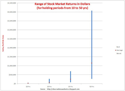
Graphs showing the range of returns over multi-year periods for the stock market as a whole usually look like an arrowhead (like the graph in this post). These graphs are easily misinterpreted. The difference between the best and worst rates of return gets smaller as the number of years increases; readers often assume that the difference between the best and worst outcomes as measured in dollars is also getting smaller. This is NOT the case -- as is clear from the graph below (click to expand).

Range of Returns for the Dow Jones Index (in Dollars, not Percentages)


Chart of best & worst stock market (Dow Jones) 10-100 year dollar returns
Range of Stock Market Returns in Dollars

Viewed in Dollars, Time INCREASES Variability


The graph above is based upon exactly the same data as the graph in the earlier post, and shows the results for the same theoretical investor, starting with an initial investment of $10,000. However, instead of showing the maximum, average and minimum annual percentage return for each holding period, it shows the maximum, average and minimum dollar value of the portfolios at the end of the holding periods. No one

Saturday, November 7, 2009

Range of Stock Market Returns in Dollars: 1-10 Years

Many investors think of stock market returns in terms of percentages -- e.g., Mutual Fund ABC returned 10.2%/year over the last 10 years. However, in my experience it is often useful to approach topics from multiple points of view. In this post, we'll look at historical stock market returns in terms of dollars; it's an especially important perspective when doing retirement planning.

Range of Stock Market Percentage Returns


In May, I posted a graph showing the historical range of DJIA (Dow Jones Industrial Average) returns for a variety of holding periods. That graph showed the results for a theoretical investor who bought and held the Dow for holding periods ranging from one to one hundred years, reinvesting dividends for the whole time. It seemed to show that the worst case got better with each passing year, and that historically the more years the investor held onto his investment the less likely he was to lose money.

Graphs like that one are often used to show investors that, while the stock market is very risky in the short term, the long-term investor faces much less risk. And that's true -- in a sense. It's especially true if the risk you are most concerned about is the risk of losing money (measured at the end of the holding period). Let's look again at exactly the same data, but from a different point of view.

Best and Worst Stock Market DOLLAR Returns for 1-10 Years


Chart of best & worst stock market (Dow Index) 1-10 year returns in dollars
Range of Stock Market Returns in Dollars

The graph above shows the results for the same theoretical investor, starting with an initial investment of $10,000. However, instead of showing the maximum, average and minimum annual return for each holding period, it shows the maximum, average and minimum value of the portfolios at the end of the holding periods. It confirms some things we already knew from the earlier graph (you may find it helpful to look at

Tuesday, October 27, 2009

A Retirement Planning Calculator / Spreadsheet

.

Putting it All Together


Retirement planning can be thought of as consisting of two phases:
  1. The accumulation phase -- saving for retirement
  2. The distribution phase -- living in retirement
In the previous two posts in this series, we looked first at establishing a target for the savings needed to cover expenses during the retirement years, and then at creating a savings plan to reach that target. In this post, we'll add some enhancements to our retirement planning Excel spreadsheet in order to create a consolidated accumulation and distribution plan -- we'll put it all together. This, in turn, will give us a foundation to do some additional analysis in future posts.

Note: For a quicker estimate of how much you'll need to save, see the graphs in How Much Money Will You Need to Retire?,  What Percent of Your Salary Should You Save For Retirement? (by starting age), or percent to save with higher incomes.


A Consolidated Retirement Accumulation & Distribution Plan


Retirement Planning: Graph showing retirement plan from Excel spreadsheet/calculator
Consolidated Retirement Saviings Accumulation & Distribution Plan

The graph above shows a retirement plan for a 35 year old, Alex, who hopes to retire at age 65 and live to age 90 (click on graph to expand it. See the end of the post for a link to the spreadsheet). Alex has no savings yet, but is planning to save 13 percent of salary from now on. Alex plans to put 3% of pay into taxable accounts and split the remaining 10% equally between

Sunday, October 25, 2009

Disclaimer

Just so there is no misunderstanding.... My intent is not to give financial or legal advice to anyone; that would require detailed information about your specific situation. The information, tools and analysis provided on this site were initially developed for my own personal use. I hope it's obvious that I cannot guarantee their accuracy or applicability to your individual circumstances. I can assure you that I have found this material useful for me; I hope you will find it useful as well in doing your own analysis.


This work is licensed under a Creative Commons Attribution 3.0 unported license.


Saturday, October 17, 2009

What Percent of Your Salary Should You Save For Retirement?


Note: If you're looking for the quicker, ballpark, estimate of how much you'll need to save, see the easy-to-use graphs in What Percent of Your Salary Should You Save For Retirement? (by starting age, with Social Security)percent to save at higher incomes, or without Social Security.)


"What percent of my salary should I save?" is a frequently asked question -- especially early in one's career. People often ask the question implicitly assuming there is a standard, magic percentage of your pay that works for everyone. I think the most honest answer is "it depends." In this post, we'll add some additional capabilities to my retirement calculator so that you can understand what the answer depends on and use the calculator to determine a percentage that works for you. (The download link is at the end of the post.)

Pat's Retirement Savings Plan


Graph. What % (percent) of salary plan to save

In How Much Money Will You Need To Retire?, we looked at a hypothetical 25 year old, Pat, who wants to retire at age 65 and have $45,000/year in today's dollars for after-tax living expenses (not income) during a 20 year retirement. The retirement calculator introduced in that post estimated that

Thursday, October 1, 2009

How Much Money Will You Need To Retire??

How much in savings will you need to retire? A lot -- even many of you who are among the vanishing breed of employees who have traditional defined benefit pension plans. In this post I will introduce a spreadsheet to help you estimate the amount you need to save. I'll also provide a simple rule of thumb for those who prefer a shortcut. (see Rule of Thumb below)

Retirement planning: Savings needed vs life expectancy graph
Retirement Savings Needed vs Life Expectancy
This series of posts will not only help you estimate how much you will need to save, and help you develop a plan to save that much, it will also help you understand the whys. Understanding the issues, and the assumptions that traditional retirement planning software packages typically make will, I hope, decrease the chances that you will misinterpret or misuse their results; this, in turn, will increase the chances of your living the retirement of your dreams.

How Much Will You Need in Retirement Savings? (In Then-Current Dollars)

For many people, the biggest savings challenge they will face is

Friday, September 25, 2009

What's Wrong With the Texans Defense?

A critical Texans deficiency last year was defense on first down; the Texans were last in the National Football League (NFL). An important reason why I expect a better record this year is that I expect better performance on first down this year. Believe it or not, so far we're getting it; first down is not the problem.

IMHO, the first (and second) down defense is considerably improved. We're creating significantly more 3rd and longs than previous years. However, Sanchez killed us on 3rd down in week one. And, while the 3rd down efficiency was better against the Titans, two of the back-breaker plays were on 3rd and long.

So, the defense is indeed creating the 3rd and longs that have been missing for so long -- but not capitalizing on them. Why is that? Third and long means

Saturday, September 12, 2009

Houston Texans 2009 Kickoff


I'm ready for some football. This year, I'm comfortable including the words "Texans" and "playoffs" in the same sentence -- but not quite in the way I had hoped.


Houston Texans Deficiencies


The Texans ended last season with three obvious deficiencies:
  1. Red zone offense: The Texans ranked third in the National Football League in total offense in 2009 and yet were only 17th in scoring. One of the best offenses in the NFL consistently bogged down in the red zone.
  2. Turnover ratio: A season that began with reducing turnovers being a point of emphasis ended with the team giving up 10 more turnovers than it caused -- not exactly what coach Kubiak had in mind, and not playoff level performance.
  3. Defense: The Texans were 22nd overall, a below average performance that must be improved if they are to become a playoff team.

The team's success in 2009 will hinge on how well they have addressed those deficiencies.

Texans Offensive Improvements


The improvements on offense will come from

Friday, August 28, 2009

Retirement Planning: Start to Invest When You're Young

Is it really important that you start to plan for your retirement early in your career? Does it really make that much difference? Starting a saving and investing program when you're young is likely more important than you think. Take a look at the charts below.

Starting to Save & Invest for Retirement at Age 25 vs. 35 vs. 45


Start saving for retirement when young: compound interest

The solid blue line above shows the results for a hypothetical investor who begins saving and investing $3,600/year at age 25. If that investor earns 8% per year, at age 65 he will have about $1 million (that's actually why I picked $3600). Readers will not be surprised to see that the hypothetical investor who starts investing at age 25 has more money at age 65 than the investors who start at age 35 and 45. However, many readers will be surprised once they fully

Monday, August 24, 2009

Are You Having Trouble Downloading the Spreadsheets?

July 25, 2020:
There has been a problem with some of the spreadsheets that have to be downloaded. I am in the process of fixing the problems, starting with -- the INFLATION CALCULATORS/SPREADSHEETS, and PLANNING TO BUY A HOUSE SPREADSHEET (which is also used in the Benchmark Buyer post). Please try those calculators/spreadsheets first and let me know how it goes in the comments on one of those posts.

The on-screen calculators should all work; just enter your data and see the results on-screen.

For spreadsheets, first click on the link for the spreadsheet you are interested in. If you see a green tab above the speadsheet that says "View Only" you are already in Google Sheets. If you do not* see that, click on the message that says "Open with Google Sheets." Once you are in Google Sheets, at the top of the page, click on File-Download-Microsoft Excel. That should let you download the spreadsheet - then click on the downloaded file in your downloaded files. You will need spreadsheet software on your computer.

If you don't have spreadsheet software on your computer (or the above doesn't work for some reason)....
Create a new blank spreadsheet on Google Drive. (If you don't have one already, you will need to create a Google Drive account.)
Click on the the link for the spreadsheet you are interested in.
Copy my spreadsheet onto the new spreadsheet you just created
You should then have your very own copy of the spreadsheet that you can enter your own data into.

Let me know how it goes, and if you need additional instructions.

Since I have been on an extended hiatus, I am not sure of the status of the other spreadsheets. If this process works for others as well, please leave a comment for me.


FOR NOW, IGNORE THE REMAINDER OF THIS POST UNTIL IT HAS BEEN UPDATED!

This blog rarely gives advice, partly because I don't know the particulars of your specific situations. More often, I will share data and/or analytical tools with readers in order to help them make their own decisions, based upon their specific circumstances. Sharing my spreadsheets is an important part of this process. However, apparently some readers are having difficulties accessing the spreadsheets.

This post will provide a central forum where I address problems that I am informed of. If you are having a problem, PLEASE let me know; otherwise I probably won't fix it. However, it is best to leave your comment on the post where you encountered the problem. Otherwise, I won't know which spreadsheet is causing the problem.

Can't Download Spreadsheet

You can never download my spreadsheets by clicking on the image in the post; that's just a picture. Clicking on the picture will normally give you a larger, clearer version of the picture, but not download the associated spreadsheet. To download the spreadsheet, look for a link -- generally near the end of the post.

Google may deny access to Google Documents/Spreadsheets if you do not have a Google account. If you don't have one, go here (they're free). Let me know if you're having problems.

In some browsers (e.g., Internet Explorer) you'll see a dialog box asking you to either OPEN the spreadsheet, or SAVE it to your PC. In some other browsers (e.g., some versions of Chrome) you may need to click on a link that appears at the bottom of your browser screen -- or at the bottom of a new blank screen.

Note: In all cases you must have a spreadsheet program on your computer -- either Excel, or a program that can read Excel files.

Downloading From Google Documents/Spreadsheets

Some of the links take you to Google Documents/Spreadsheets. If you end up there, while in Google spreadsheets click on File - Download.

Can't Enter Data

To enter data you must actually download the associated spreadsheet; clicking on the screenshot will expand it, but not allow you to enter data. The link to download the spreadsheet and enter data is usually at the end of the post.

Multiple Worksheets

Many of the models are Excel workbooks containing multiple worksheets. To navigate between worksheets,

Friday, July 31, 2009

A Borderline Home Buyer as Benchmark: Can I Afford This House?


Home Affordability "Benchmark"


This post discusses the "Borderline Buyer" column of the Planning to Buy a House Spreadsheet. The previous post covered the Proposed Purchase column. As you might guess, the Borderline Buyer column develops a profile of a borderline buyer for the property you are proposing to purchase.

My borderline buyer is pushing the typical debt load limits. As a result he should not thought of as a benchmark in the sense of being a buyer to be emulated. He is just barely able to afford this house! In my opinion, a buyer's objective should not be to get as close as he possibly can to the lender's limits; the closer he is to these limits, the closer he is to the limits of his ability to manage his debt (and the more he is at risk of ultimately losing his home). Still, this is a great buyer to compare yourself against.

Excel spreadsheet to evaluate/benchmark purchasing a home affordabilityNote: Click on the above screenshot to expand it. The link to download the spreadsheet is at the end of the post.

The Borderline Buyer Column


Above is a portion of the Excel spreadsheet (click to enlarge. The link to download is at the end of this post). The benchmark buyer column represents

Sunday, July 19, 2009

Planning to Buy a House Calculator

Home Affordability Calculator: How Much House Can You Afford?


This interactive calculator can help you plan to buy a house, and answer typical home purchase related questions such as, given your assets and income:
  • What price can I afford to pay for a house?
  • What size home mortgage loan can I qualify for? How much will I be able to borrow?
  • When will I be able to afford to buy?

The calculator will also help you overcome some of the issues raised in The Disadvantages of Buying a House and Planning to Buy a House by helping you to budget for the total cost of owning your home. It helps you make adequate allowances for housing expenses and at the same time keep those expenses within standard established income & debt-load guidelines. Links at the bottom of the post provide additional help in estimating those expenses.

The Buying a Home Calculator


Notes: You can use the arrows and sliders on the right side and bottom of the calculator to scroll up and down, and left and right. Enter data only in the blue cells. On some phones you may need to double click to enter data. On some computers, you may have to enter some fields more than once for it to "take."

Please leave a comment if you are having problems.


Buying a House Calculator: Primary Inputs

The first section contains the primary inputs to the model. They are entered directly on your screen in the blue cells enclosed in black borders. They include:

  • Annual gross salary
  • Current and anticipated savings
  • Your planned monthly housing expense -the total amount you expect to be able to budget for monthly principal, interest, taxes, insurance (PITI), plus maintenance expense... PITIME!
  • The purchase price under consideration
  • Your planned down payment
  • Expected mortgage interest rate

Additional inputs (blue cells not enclosed in black borders). You may have to scroll down to see some of these:
  • Mortgage length in years
  • Property tax expenses
  • Insurance and maintenance expenses
  • One-time purchasing costs other than the down payment
Notes: Update the default amounts and percentages with numbers appropriate for your situation. Ignore the warning and error messages until you have finished entering your data. If you are reading on a mobile device try landscape mode to see if you prefer that.

How the Calculator Works When Planning to Buy a Home: An Example

In this illustration, a hypothetical buyer is considering buying a $200,000 home two years from now, is  planning to make a down payment of $30,000, and is expecting to get a 3% mortgage for the balance. Given his $50,000 annual salary and current monthly expenses, he expects that he will be able to set aside $1000 each month for housing expenses. The spreadsheet then helps the buyer flesh out and test this plan.


The Expenses Section (you may have to scroll down to see this section)

In the Expenses - Principal & Interest section: given the home purchase price, the down payment and the expected 30-year mortgage interest rate of 3.0% on the $170,000 mortgage balance, the calculator determines the monthly principal and interest payments of $716.73 per month.

In the Expenses - Taxes, Insurance & maintenance expenses section: based upon the price of the house, and input in that section, the spreadsheet makes an initial estimate that property taxes, insurance and maintenance costs will average approximately $675/month. The buyer can update these estimates as additional information becomes available.

In the Expenses - One-Time section: we see that the planned down payment plus the initial estimate for miscellaneous one-time costs will total $40,000.

The Summary Results Section

This section reviews the buyer's proposed purchase, comparing one-time and on-going costs to his plan/budget and to various home affordability guidelines.

In the Down Payment section, the buyer is warned that the down payment is less than 20%. The Problem With Low Down Payments discusses the risks of down payments smaller than 20% in some detail. Those making smaller down payments will generally also need to purchase PMI (mortgage insurance); that cost has not been included in these calculations; if needed you can add it to the "taxes, insurance & maintenance expense."

Since the buyer has $12,500 in savings and will save an additional $15,000 over the next two years, the spreadsheet calculates that he will have $27,500 in savings available at the time of purchase, plus $10,000 contributed by the buyer's rich uncle (note: gift down payments are subject to certain restrictions). The message warns that the $37,500 he will have at the time of purchase is $2,500 less than the anticipated need to cover the down payment plus the additional one-time expenses. This is generally resolved by saving more each year, saving for more years, or buying a less expensive home.

Next is the on-going costs section of Summary Results. There we see that monthly PITIME costs (PITI plus anticipated maintenance expenses) total $1391.73. The buyer is warned that this exceeds his budget.

 Next, the buyer's data is compared to some standard benchmarks. The buyer's housing expense is 33%. He is warned that this is more than the 28% of gross salary that is the normal standard. The buyer's housing expenses combined with his other debt result in a total debt load of 41% - more than the 36% benchmark typically used by mortgage companies. The model will only flag those with greater than 36% debt. However, in my own personal finances, I try to lower that "other debt" -- especially high-interest credit card debt as low as I possibly can.

Note that I am being a bit conservative in those last two calculations. I have included all of the buyer's anticipated maintenance expenses in housing costs; most banks and mortgage companies only include maintenance expenses for which you are contractually obligated such as homeowners' association charges. Your home may be the largest investment you ever make; I think it pays to take care of it. However, note that these are just guidelines. For instance, homeowners in high cost areas such as New York City and San Francisco often exceed these guidelines.

Total Cost of Ownership


The final line of the Summary Section is the one-line “Total” section. It suggests that though this buyer might think of this purchase as a one-time commitment to pay $200,000 for a home, it is instructive to think of the total cost of ownership. Using a modified total cost of ownership calculation, we see that before he actually owns this home we expect this buyer will have spent more than $500,000 over a period of 30 years. 
 
The second number in that section shows that just paying off the $170,000 mortgage (i.e., only principal and interest payments) will cost over $250,000 – because the buyer will pay over $80,000 in interest over the course of the 30-year mortgage. Note that both these “total cost” numbers are historically low. As recently as 2008, when mortgage rates exceeded 6%, the total principal and interest for this mortgage would be more than twice the size of the mortgage amount, and the total cost of ownership would have been approaching $650,000.

Fine-Tuning Monthly Expense Estimates


The model can be used to begin planning years before the actual purchase. Initial estimates are likely to be ballpark estimates. As you home in on specific neighborhoods and homes, your realtor will be able to help you more accurately estimate your mortgage interest rate, property tax rates, etc. In some cases you can even get historical utility expenses. Your estimates can be refined so that ultimately they are precise enough for monthly budgeting purposes. Some of the links at the end of the post will also help you refine your estimates..

Estimating One-Time Expenses


Your realtor will be able to help you arrive at an accurate estimate of closing costs.

It's helpful to mentally walk through every room to identify needed/wanted additional furniture and fixtures: bedrooms (furniture for a 2nd bedroom?), LR (a new couch/chair?), kitchen (small appliances, dishes, pots & pans, ...), etc. Don't forget the walls (draperies, paintings?), floors (throw rugs?) and ceiling (new fixtures?). Then there's the garage (shelving?, toolkit for minor repairs & maintenance), and outside (lawnmower, rakes, snow blower?).

If you are a first time homebuyer, the list of things you're likely to want or need will astound you; you'll probably need to spread these purchases over a number of months, or years. To avoid putting your finances under stress, it is critical that you consider these costs, and budget for them. (For links to help with estimating the one-time expenses, see "Related Posts" below.)


Related Posts:

Planning to Buy a House discusses some ways to increase your chances of becoming a successful homeowner.
The Risks & Disadvantages of Buying a House : The pros are well advertised, but there are cons as well.
The Risks & Disadvantages of Low (3%, 5%) & No Down Payment Mortgages: The risks of 0% - 10% down mortgages.
100 Years of Housing Price History Robert Shiller's index of housing prices since 1900, & intro to the economics of real estate.
The Observations Inflation Calculator converts prices to equivalent prices in another year.


Links for Help in Estimating Expenses


I always start with an overall action plan for my move that covers everything that needs to be done. Unfortunately, every step in your move has the potential to generate expenses. If you Google "Moving Checklist," you'll see links like this.
MyMove can help you with your checklist and virtually anything else that has to do with your move. 
I estimate the cost of the physical move starting with an estimate from a full service mover such as Allied . You can get a ballpark estimate for the lower end/"do it yourself" spectrum of moving expenses from sites such as U-Pack.
Arrange a Room can help you see how your furniture fits in your new space and begin to estimate additional expenditures that will be necessary/desirable.
This article and this article address those impossible-to-estimate maintenance costs.

Share This Article

To share via Facebook, Twitter, Pinterest, etc., see below except on mobile devices (where you share in the normal way).

Copyright © 2009. Last updated 9/30/2020

Can I Afford This House Excel home affordability calculator /spreadsheet Can I Afford This House Excel home affordability calculator /spreadsheet

Archives:

Planning to buy a home Excel spreadsheet/calculator

Thursday, July 2, 2009

Notice

Until I finish recovering from surgery I will be posting less frequently than normal. I hope to be back to my normal "schedule" by the end of the month.

Saturday, June 27, 2009

Implementing Your Personal Strategic Plan


One of my favorite planning quotes is "Planning is the design of a desirable future." For our purposes here, the emphasis must be on the word "design."  Now that you have "designed" your future, you have to construct it!  You have your blueprint. Now, we come to the hard work part of achieving goals --
Implementing Your Plan

Keep Your Plan in View

Have a one page version of the highlights of your plan in view to automatically remind you of your plan every day -- for example, on the refrigerator, on the bathroom mirror, or in a picture frame by your bedside.

Use a Dream Board to Keep Your Dreams in Mind

Another good tool for reminding you of your dreams, especially if you are more visual, is a Dream Board. The idea is to create a collage of pictures of your dreams -- pictures that evoke the feelings you will have when you achieve your dreams.

A picture of a Paris outdoor cafe, or the French Riviera can serve as a constant reminder if you've always dreamed of going to France.  For years I've used a famous picture of Michael Jordan to remind me how good it feels to accomplish an extremely difficult goal that you have worked hard for; I love that feeling. A picture of a happily retired couple can spur you to save more.  The possibilities are endless.

Dream boards can be a very powerful tool. You want at least one picture for each dream. You can include pictures for some or all of your major goals as well.

In the old days, the primary source of pictures for dream boards was magazines. Now, images are easier to find on the internet (e.g., using Google Images). I use a mixture of both. The advantage of magazine pictures is that they tend to be higher quality. Equally important, it takes longer to find pictures in magazines; that means you spend more time searching -- and more time thinking about and visualizing your dreams.

Some people mount their pictures on poster boards. I've even heard of people who use a whole wall! I like to use 18" x 24", or larger, poster frames. That way it's easier to replace a picture with another picture that captures my dream even better -- and, it gives me a reason to think about my dreams all year long as I search for more and more effective pictures. (Amazon has some inexpensive poster frames that work well.)

Spending a few minutes a day viewing your Dream Board can be a very powerful reminder and motivator. For a more in-depth discussion of Dream Boards see this post.

Mottoes and Mantras

In this case, I mean a short phrase that you can use as a constant reminder of important, possibly of unrelated, aspects of your strategic plan.  For example, "You reap what you sow" can remind you that you won't reap the fruit of a comfortable retirement without sowing the seeds of savings.  You won't reap "prima ballerina" or "successful father" without first sowing those seeds.

Realizing goals is about deciding what you want to reap, and then sowing the proper seeds.  Too many people are surprised when things happen, or don't happen, for them that others think are absolutely predictable. A useful exercise for some is to ask yourself what seeds other people would guess you are sowing. And, that leads me to....

Get Help!

Don't be afraid to get input from other people. People you love and trust can often give you insights into your strengths, weaknesses and possibilities that escape you.

No man is an island! To be the person you ultimately want to be will require help from others. In the business world, these are called "stakeholders" -- others that are somehow involved in the successful implementation of your plan. Get their perspectives on your plan. Get their feedback, and, ideally, their encouragement and support; it can be invaluable. In addition, sharing your plan with others can help you increase your own commitment to your plan.

Success Requires Action

The plan is just your roadmap, you still have to make the journey. Remember, a plan is only part of the reason why people are successful. You still need HARD WORK. There are no magic bullets.

To help you transition from planning to action I suggest you consider a calendar, and weekly/daily to-do lists if you are not already using these tools. Simple to-do lists can be kept using paper and pencil, a smart phone app, or your PC (try Googling "Simple to-do lists" for examples). Software such as Microsoft Outlook often provides a more robust solution. For example, in addition to providing an electronic calendar, Outlook allows you to categorize to-do items (e.g., you can use your dreams or goals as categories), and assign priorities, start dates and due dates.

Monitor Your Progress

Review your progress at least once a month. Are you happy with your progress? If not, what can you do to improve your performance?

Keep Your Plan Evergreen

Update your plan yearly; typically, this will mean making minor changes at the strategy level rather than at the goal or dream level (and will not require a complete re-do). Re-do your plan from scratch (i.e., rethinking mission, vision and SWOTs) as you approach the end of the planning period -- e.g., 5 years -- or if there is a major change in your life in the interim, such as those mentioned in Do You Need a Personal Strategic Plan?


p.s If anyone knows the source of my lead quote, please leave a comment.  I think it was Frank? McCracken, but I don't remember the name of the book/booklet.  Google searches have been fruitless....

****************


Related Posts: Potential Next Steps

How Much Money Will You Need to Retire? Establishes targets for all salary levels.

What Percent of Your Salary Should You Save for Retirement? (by starting age)
My SIMPLE Retirement Saving Calculator/Spreadsheet: The spreadsheet used to create the above graphs
A Career Planning Approach: An approach to career planning that is useful in other areas as well.
Planning to Buy a House Calculator: An interactive home purchase planning tool
For a schematic that shows the relationship between all of the planning posts, see Personal Strategic Planning Schematic

Additional Reading

For a more detailed treatment of mission/goal-oriented time management, see Steven Covey's book First Things First: To Live, to Love, to Learn, to Leave a Legacy.

The picture is from Public Domain Pictures.

Last updated 12/28/2012      Copyright © 2009 


Share This Post

To share via Twitter, Facebook, Pinterest, etc. see below.

Thursday, June 18, 2009

Stock Market Normalized Earnings and Returns


Cyclical Stock Market Returns


In the most recent stock market post, we looked at 10 Year Rolling Returns vs. the normalized P/E Ratio in an attempt to discover what was causing the very regular stock market cycles that we first observed in the 10 Year Rolling Returns post. The graph provided clear visual evidence of both the the cyclicality of (normalized) P/E ratios and the impact of those ratios on future returns. More specifically, it was clear that, as a general rule, investors who bought when the normalized P/E ratio was high experienced low 10-year returns; on the other hand, investors who bought when the normalized P/E ratio was low experienced high 10-year returns. (If you are not familiar with normalized earnings and P/E Ratios, see this post for a more detailed discussion.)

Stock Market Earnings


I think over the long run earnings are a more important determinant of stock market performance than price/earnings ratios. Therefore, it seemed reasonable to ask to what extent, if any, earnings contributed to the cyclicality that we observed in returns.

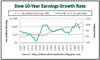
Over the long run, earnings can continue to go up indefinitely -- the P/E ratio cannot. The second chart in the Dow P/E Ratios since 1929 post shows that while the normalized P/E ratio has gone up and down, normalized earnings appear to have gone steadily upward. It turns out, that chart is somewhat misleading -- to me anyway. The increase in normalized earnings is not as steady as it appears in that chart.

Dow 10-Year Normalized Earnings Growth Rate


Graph of stock market (Dow) earnings growth rate

In the above chart (click to enlarge) the dotted line shows the same normalized earnings (NE) as in the P/E Ratios since 1929 post, again using a log scale. (For a discussion of log scale, see this post.) In addition, I've added

Tuesday, June 9, 2009

About P/E, Normalized Earnings and Normalized P/E Ratios

Valuation


How do you determine whether something is cheap or expensive? Often, valuation is expressed in terms of price per unit. For bananas, you calculate the price/pound; for homes, price/square foot; and so forth.

When you own a share of stock, you own a portion of a company. As a result, you own a portion of its earnings. Therefore, stock market valuation is often measured by the price the market is willing to pay for a dollar of yearly earnings -- that is, by the price/earnings (P/E) ratio. To calculate the ratio, you divide the price of a company's stock by that company's earnings (per share) for one year. If the result is, say, 17, your broker might tell you Company X has a P/E of 17, or Company X is selling at 17 times earnings. The P/E is also referred to as the earnings multiple.

Similarly, since you also own a portion of the company's dividends, valuation is sometimes measured by the price/dividend ratio -- i.e., how much the market is willing to pay for each dollar of yearly dividends (per share). Other methods of valuation include price/cash flow and price/book value (the accounting, or "book," value of the company's assets).

Normalized Earnings (NE)


When evaluating the earning power of a business as of some point in time, what earnings should you

Wednesday, June 3, 2009

The 10 Best NBA Players Ever

Who Were the Greatest NBA Players of All-Time?


In my last basketball post, I looked at "Total" Production per-Minute -- a rough measure that I use to evaluate the performance of the players on "my" team, the Houston Rockets. At the time, the Rockets were battling the Lakers for the right to go to the NBA (National Basketball Association) Western Conference Finals, so I threw Kobe Bryant into the mix to see how our best player, Yao Ming, compared to the Lakers' best player. Kobe won.

But, that got me thinking.... Using this measure, who were the best NBA players ever? Who were the best of the best, the greatest of the many great NBA players I have seen over the past more-than-half-century? The table below shows you how it came out (click to expand).

Best NBA Players Ever?


Best / greatest NBA player & players ever
Best NBA Players of All-Time?

First, let me remind you, who's "best" depends on your evaluation criteria. These are not the only possible criteria. What this methodology has going for it is:

Tuesday, May 26, 2009

Creating A Personal Strategic Plan


Creating Your Personal Strategic Plan


This post will help you create the document that could change your life -- your first personal strategic plan! Based on earlier posts, you've already described your dream/ideal future; your SWOTs have documented the obstacles that must be overcome to realize that dream, and the skills & resources you possess to overcome those obstacles. Now it's time to analyze your SWOTs and create a roadmap to the future you've dreamed of.

Your completed plan will contain your dreams, goals and strategies. It will list all of the critical goals that you need to achieve in order to realize each of your dreams. Not only that, it will remind you of the steps you need to take in order to achieve each goal -- what you need to start and stop doing, and by when. Finally, it will make clear why you need to take each step by linking each step to a goal and a dream. For example, you need to start giving yourself a weekly allowance (strategy), as part of your new annual budgeting process (goal), so that you can realize our dream of getting your financial affairs under control and retiring with $1,000,000!

SWOT Analysis


To get started, organize your SWOTs into groups, starting with one

Wednesday, May 20, 2009

Stock Market Rolling Returns vs. Price/Earnings (P/E) Ratio Graphs

(Last updated Sept 2020)
In this post, we are going to continue our investigation of stock market rolling returns. In previous posts, we have looked at the range of stock market returns over periods of from one to 100 years, and drilled down to look at "rolling" returns from two to 50 years. The rolling returns series was fascinating, to me anyway, because I was surprised by the cyclicality -- especially by the regularity of the 10-year rolling returns cyclicality. In addition, I expected the cyclicality to wash out by the time we got to 50-year rolling returns. It did not.

The obvious question is what is causing the cyclicality?

Stock Market 10-Year Rolling Returns vs. Price-to-Earnings (P/E) Ratio Graph


Stock market history: price/earnings (p/e) ratio vs next 10-year returns 2020
Dow Rolling 10-Year Returns vs. P/E
Above is a graph (click to expand) of the 10-year total return of the DJIA (Dow Jones Industrial Average) compared to my normalized P/E ratio. If there is a chart that I find even more fascinating than the 10-year rolling returns chart, it's this one. Each point on the rolling return graph represents

Thursday, May 14, 2009

A Personal Strategic Plan Example

Achieving personal goals through use of a personal strategic plan

Personal Strategic Planning Can Change Your Life


Not many years ago, a friend confided that she was less than thrilled with her life -- especially with her career. This came as a surprise to me since she was a young, up-and-coming professional earning a good salary. However, she confessed, her real dream was to become a doctor. This is probably not a career her college science professors would have recommended; she had not done well in their classes.

Three years later, after completing the required pre-med science courses (going to school at night), she was in med school. Four years after that, she was a doctor. She is now living her dream.

Why was she successful? She had a compelling dream; she worked hard; and, she had a personal strategic plan.

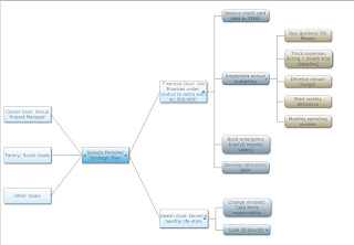
Example of Personal 5-Year Strategic Plan (high-level view)


Mind Map Diagram of Sample Personal Strategic Plan
Sample Personal Strategic Plan (click to enlarge)
In this post, I will sketch out the beginnings of a personal strategic plan to give you at least a general idea of what your completed plan might look like. The formats I'm using, while typical, are just "for example."  You can use any format that works for you.  And, you don't need any special computer software; it will work just as well with plain old pencil and paper -- which, by the way, is what my friend used for her plan.

I hope this example will make it easier for you to understand the purpose of each step in the planning process. The partially completed strategic life plan above is for an individual; however, the process works equally well for a family.

The above "mind map" was produced using SmartDraw (click on diagram to expand it); it supplements the discussion below. Here's the same plan using a more traditional format in Microsoft Word - Outline View. (again, click to expand.)

Sample Personal Strategic Plan

Personal Strategic Planning Starts with Your Dreams

Let's assume that as you dream about the future you'd like to create 5 years from now, you decide that

Friday, May 8, 2009

Best & Worst Stock Market Returns for 1-100 Years

In my stock market database, the longer the holding period, the smaller the gap has been between the best and worst annual percentage return. However, the graph below may not mean what you think it means.
In recent posts, we have looked at stock market performance over rolling 5, 10, 20 and 50-year periods on a more or less stand-alone basis. However, it also makes sense to look at these returns as a group -- as a series. What can we learn by analyzing differences in performance as we go from 1 to 100 years? The most obvious place to start is with the range of returns.

Chart of Range of Stock Market (Dow) Returns Over 1 to 100-Year Periods


Chart showing best & worst stock market (Dow Jones Index) returns in history for 1-100 years
Range of Stock Market (Dow) Returns

The graph above (click to expand) shows the best, worst and average DJIA (Dow Jones Industrial Average) annual returns for holding periods ranging from one year to 100 years. The assumption is that

Sunday, May 3, 2009

Houston Rockets "Total" Production per-Minute

"Total" Production Per-Minute (A Simple Model)


A lot of people are surprised by Luis Scola's "emergence" during the National Basketball Association (NBA) playoffs. They wouldn't be if they had been looking at the stats that I track. You could make a strong argument that Luis has been the second most productive Rocket all season -- at least on offense. If you're surprised by the guy in first place, you haven't been paying attention.

The most reported measures of basketball productivity are points, rebounds and assists. Since these have been typically regarded as the primary measures of the contribution of a player, it makes sense that a reasonable first approximation of a player's total contribution is a combination of these three stats. However, normally the NBA reports these stats on a per-game or season-to-date basis. I prefer to look at these stats on a production per minute or per 40 minutes basis (my approximation of the results for a full game). This helps me adjust for the significant differences in minutes played -- especially by starters vs bench players. In the first post in this series, we looked at the Rockets' points, rebounds and assists per 40 minutes played.

Houston Rocket's "Total" Production Per-Minute


Below is a table summarizing the Rockets' "total" production per 40 minutes of playing time. The top 3 are Yao Ming (37.3 units of production per 40 minutes of playing time), Luis Scola (30.3), and Tracy McGrady (29.6). As I mentioned, the "surprise" is Scola in second place. If T-Mac had been healthy, it seems reasonable to assume that T-Mac would have come in second, given his 35.9 average last year. However, even in third place Scola would be a surprise to some.

The traditional NBA reported statistics essentially ignore defense -- primarily because a) it's not "sexy", and b) it's difficult to measure. In effect, this "total" metric assumes all of the players are equally effective on the defensive end. As a result, it undervalues players if a major portion of their contribution comes on the defensive end of the court. For the Rockets, this means it especially undervalues players like Chuck Hayes, Shane Battier and Ron Artest; maybe Yao as well -- though probably not relative to other centers.

Houston Rockets Offensive Statistics Per Minute Table
Houston Rockets Total Production Per Minute Statistics


Since the Rockets are about to go into the second round facing the LA Lakers, you might be interested in how Kobe Bryant stacks up against the Rockets using this metric. With 2201 points, 429 rebounds and 399 assists in 2960 minutes, he'd be first -- with a rating of 40.9 per 40 minutes of playing time.


Related links:


Houston Rockets "Per-Minute" Statistics (points, rebounds, assists)
More Houston Rockets "Per-Minute" Statistics (blocks, steals, FTAs)
The 10 Best NBA Players Ever calculates "total production" for some of the all-time greats.
The source of my data is nba.com

Last updated 2/15/2010

Tuesday, April 28, 2009

The Best & Worst 5 (and 50) Year Returns in Stock Market History

In recent posts, we've looked at intermediate-term stock market performance -- in particular, returns over 10 & 20-year periods. In this post, at the request of a reader (John W), we'll look at 5-year returns. I'm not sure what to call five years; to me, it's not really a long enough period to consider intermediate term, but too long to call short-term. In any event, we'll again look at rolling returns beginning around 1900.
(Note: This post covers returns through year-end 2008; for the most recent 5-year return, see this post.)

"Rolling" 5-Year Stock Market (Dow) Returns Graph


100 year stock market (Dow) history: rolling 5-year returns
Dow 5-Year Rolling Returns

Above is a chart of the five-year total return of the DJIA (Dow Jones Industrial Average) beginning around 1900. Each point on the graph represents the average annual return earned by an investor who bought the Dow at that year-end and sold 5 years later, reinvesting dividends in the interim. For example, the first point on the graph shows that an investor who bought at year-end 1901, reinvested dividends annually, and sold at year-end 1906 earned approximately 13% per year. As always, I've had to estimate the dividends prior to 1929.

The Best & Worst 5-Year Returns in History


As usual, the worst return (-16.4% per year) resulted from buying before the 1929 crash -- 1927 in this case, rather than our usual 1928. (Note: for more on the 1929 crash, see this post.) Also as usual, the best returns were the result of, in effect, selling near the top of a bubble. Buying in 1923 and selling in 1928 earned a 30.7% 5-year return; buying in 1994 and selling in 1999 earned a 26.8% return. Finally, again as usual, the average return was 10%.  (Note: For a very different way of looking at the best and worst five year returns, see Range of Stock Market Returns from 1-10 Years in Dollars.)

Observations & Questions


Not surprisingly, the best 5-year return is better than the best 10-year return, but not as good as the best 1-year return. The worst 5-year return is worse than the worst 10-year return, but not as bad as the worst 1-year return. In addition, while I don't think the cyclicality of the 5-year returns is as pronounced as the 10-year returns, it's clearly more than is visible in the 1-year returns. And, that starts me down a whole new path.

We've been looking at the rolling returns to see what we can learn from them individually. However, there is clearly some kind of a pattern developing if we think of them as a series. For instance, you might ask, as you go from 2-year rolling returns to, say, 100-year rolling returns, what happens to the range of returns? When does the cyclicality start? When does it end? And, what's causing it??

John, thanks for encouraging me to continue this line of inquiry. As a first step, let's take a look at a longer-term rolling return.

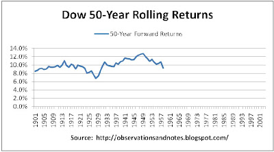
Dow 50-Year "Rolling" Stock Market Returns Chart


100 year stock market (Dow) history: rolling 50-year returns
Dow 50-Year Returns

The winner is (drum roll please) 1949, with a 12.8% annual return for the next 50 years -- at least partly because, 50 years from 1949 is ... 1999. And, the loser is (another drum roll) 1928, again, with a 6.8% annual return -- for the next 50 years. (Note: The average return was again 10%.) Remember, these are nominal returns, so assuming inflation averaged around 3%, the real return from 1928 was 3.8%. (For more on nominal vs real returns, see this post). As we have seen (e.g., in Stock Market Yearly Returns), investing in the stock market for 50 years exposes you to substantial year-to-year risk. Seems like a lot of risk, and for a lot of years, for less than 4% real return....

I have no idea how you know when you're 50 years before a bubble peaks so that you can buy. But, maybe we have a hope of figuring out when we're already at or near a peak so that we can at least consider not buying.

Let's keep digging.


Note: The above charts are based on DJIA (Dow Jones Industrial Average) data from my Stock Market Analysis Model. Results would be essentially the same if we used S&P 500 data.  Dow dividends prior to 1929 have been estimated using another stock market index.

Related Posts:

See the sidebar to the left for an index of all stock market posts, by subject area -- including:
Why Investing in the Stock Market for Less Than 5 Years is Risky: A look at the distribution of the 5-year returns, in dollars.
Range of Returns for 1 to 100-Year Holding Periods graph of best & worst past returns for 1,2,3 ... 100-year periods.
Earnings, Dividends Determine 50-Year Returns: decomposing 50-year returns into return contributed by earnings growth, dividends, change in p/e.
Range of Returns in Dollars for 10-100 Years for a very different look at 50 year returns.
The Best & Worst Years in Stock Market History: 1-year returns
The Best & Worst 10 Years in Stock Market History
The Best & Worst 20 Years in Stock Market History
Rolling 35-Year Returns
Projecting Stock Market Returns

Last modified 8/9/2011

Thursday, April 23, 2009

About Nominal & Real Rates of Return

Nominal Rates of Return


The nominal rate of return is the return that you see most often in the news; most published rates of return are "nominal" rates of return. This is true whether they are stock, or bond returns. For example, if you pay $100 for a CD that will pay you back your $100 plus $5 in interest one year from now, the interest rate is quoted as (5/100=) 5%. Similarly, if you invest $100 in mutual fund XYZ on January 1 and a year later those shares are worth $105, the return on that fund is also 5%. If, in addition, the fund pays you $3 in dividends at the end of the year, the total return will be quoted as ((5+3)/100=) 8%. As an example, here is a graph of stock market nominal return history by year.

While nominal rates of return are "the standard," they can be somewhat misleading -- especially when looking at returns over many years. That's because they ignore the impact of inflation.

Real Rates of Return


"Real" rates of return reflect the impact of inflation. If inflation is 3% per year, then a year from now it will cost $103 to buy what we can buy now for $100. In that case, if we have a $100 investment that earns 3% in nominal terms, a year from now it will represent the same purchasing power as it does today, but no more. That's because goods that you could buy now for $100 will cost you $103 a year from now. In that case, the "real" return is (3% nominal return on investment, minus 3% lost to inflation=) 0%. So, in our examples above, the real return on the CD is (5% - 3%=) 2%; the real total return on XYZ is (8% - 3%=) 5%.

In this blog, returns are always nominal returns -- unless otherwise stated. I call real rates either "real," or "inflation-adjusted."  For example, here's a graph of 10-year Treasury Note Real Returns compared to nominal returns. If I'm looking at long-term nominal returns, I mentally subtract about 3% per year in order to approximate the real rate of return.

Some Implications


It is often important to look at real rates of return when comparing rates of return during different eras. For example, a 12% 1-year CD when inflation was 14% per year, say, during the early 1980's, gave you a real return of (12% - 14%=) -2% -- i.e., you lost 2% of your purchasing power. On the other hand, a 3% CD when inflation is 1% has a (3% - 1%=) 2% real rate of return. The 3% CD is actually a better deal than the 12% CD was!

It's especially important to consider inflation when looking at performance over a long period of time. For example, a $100,000 house purchased 24 years ago and now worth $200,000 has had nominal price appreciation of 3% -- and, assuming inflation has averaged 3%, a real appreciation of 0%. At three percent inflation, prices double approximately every 24 years. Note that this also means that, for example, over a period of 24 years, the purchasing power of a $2,000/month pension would fall to the equivalent of about $1,000/month. Therefore, when doing retirement planning it is critical that you either use real rates of return, or adjust your future income and expenses for inflation.

Related Posts

100 Years of U.S. Inflation History: includes o'view of impact on major asset classes.
100 Years of Inflation-Adjusted Stock Market History: Closing prices adjusted for inflation

Last modified: 3/25/2011

Monday, April 20, 2009

More Houston Rockets "Per-Minute" Statistics

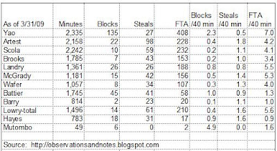
In a previous post, we looked at the most frequently reported Houston Rockets statistics -- points, rebounds, and assists. In this post, let's look at blocks, steals and free throw attempts -- an important, but underappreciated statistic, for reasons that I will explain. While the National Basketball Association (NBA) normally reports these as season-to-date and per-games-played totals, I prefer to look at them on a per-minute, or per 40 minutes of playing time, basis.

Blocks per 40 Minutes of Playing Time


The top 3 are Dikembe Mutombo (4.9 blocks per 40 minutes of playing time), Yao Ming (2.3), and Shane Battier (1.0). Deke leading the way is, of course, no surprise; he's one of the best shot-blockers in the history of the game. However, his 4.9 is probably artificially high because he played so few minutes; the prior two years, he was right around 3.

The surprise here, for some anyway, is Shane -- and this was an off year for him. My sense is that it took him more than half the season to fully recover from his off-season surgery; otherwise, his number might have been closer to the 1.4 he had last year. Another surprise, for some, is the under-appreciated Chuck Hayes, with 0.9. Landry was close behind with 0.8 -- a big increase over last year's 0.4.

Steals per 40 Minutes of Playing Time


The top 3 are Ron Artest (1.8 steals per 40 minutes of playing time), followed by Chuck Hayes and Kyle Lowry (tied at 1.4). No one should be surprised to see Artest in first place. But, here's the "Chuck Wagon" again excelling at defense -- in this case, because he has quick hands. Note: I'm trying to get a good read on Lowry's game, so I'm using his full season totals -- i.e., I'm including his games with Memphis.

Free Throw Attempts per 40 Minutes of Playing Time


The top 3 are Yao Ming (7.0 free throw attempts per 40 minutes of playing time), Kyle Lowry (5.6), and Carl Landry (5.5). I wouldn't have been surprised if Yao's number was higher. In fact, you could argue it should have been higher. For reference, take a look at Shaq (9.2) and Dwight Howard (12.0)!

I'm using free throw attempts to approximate the number I'd really like to see -- fouls drawn. (If anyone knows where I can get fouls drawn please let me know.) It's an under-reported and under-appreciated stat. Drawing fouls is important not only because you get free throws (sometimes), but also because:
  • You get the opposing team closer to its limit for the quarter -- so, you're increasing the number of foul shots, and points, your team will get later in the game.
  • You get the opposing player closer to his limit for the game. If he's a starter, and he fouls out, he'll be replaced by a less accomplished player -- which generally means fewer points for the opposition, or more points for your team, or both. More likely, he won't foul out. However, you've still increased the probability that you will be able to get that player in foul trouble and force his coach to play him fewer minutes. Again, a less accomplished player will replace him. Finally, you've increased the probability that, in order to avoid another foul, he'll play less aggressive defense -- which increases the probability that your team will score. It's most obvious when you see a good shot blocker not even attempt to block a shot because he can't afford to take the chance of another foul.

Rockets fans have seen the impact of fouls demonstrated many times -- especially in Yao's early years. How many times have we lost a game because foul trouble limited Yao's minutes?

One of the reasons I'm so fond of Kyle Lowry is because of his ability to draw fouls. Don't misunderstand, I'm a big "AB" fan as well -- he and Kyle are just very different point guards. Having both may well turn out to be a significant plus for the Rockets during this year's NBA playoffs. This is another example of the depth and flexibility that the GM, Daryl Morey, is building into this team, as I mentioned in my season kickoff post. Tracking free throw attempts allows you to "guesstimate" how many fouls a player draws on the offensive end -- but not on the defensive end. Looking only at free throw attempts, Shane Battier and Chuck Hayes come in 10th and 12th on the team. That obviously significantly underestimates the contribution that those two make drawing fouls.

I'll try to do at least one more post in this series in the next couple of weeks -- as long as the Rockets are still playing....

For more detail on the above stats, see below.

Houston Rockets 2008-2009 Production per 40 Minutes Played


The table below (click to enlarge) shows the Rockets' results per 40 minutes of playing time for blocks, steals, and free throw attempts. For example, I divide a player's total blocks by his number of minutes played to get blocks per minute, and multiply that result by 40 to approximate his results for a full game (players rarely play a full 48 minutes). Note: I've omitted Brian Cook, Joey Dorsey and James White; they didn't play enough minutes to yield reliable results.

Houston Rockets "Per Minute" Statistics
Houston Rockets statistics (blocks, steals, free-throws per minute

Related Material:

Houston Rockets "Per-Minute" Statistics
Houston Rockets: Is it Time Yet?
Houston Rockets "Total" Production Per-Minute
The source of my data is NBA.COM

Last modified 3/12/2010