Saturday, December 31, 2011

2011 End-of-Year Stock Market Update

Just to refresh your memory, here are a few market-moving stories from the past year.

Monthly Stock Market Closes for 2011


Stock market (DJIA) 2011 monthly closing prices thru year-end

December, 4th Quarter, Year-To-Date & Recovery-To-Date Review

Previous posts have demonstrated that the market periodically experiences "long, flat periods." This certainly seems to be one of those. Perhaps it was in that spirit that the S&P managed to end 2011 0.02 points away from where it ended 2010!

The DJIA (Dow Jones Industrial Average) fared somewhat better, closing the year at 12,217.56.  Here are some key market stats.

  • From Prior Month Close of 12,046: The Dow is up 172 points (1.4%)
  • From 3rd Quarter Close of 10,913: Up 1304 points (12.0%)
  • From 2010 Close of
Wednesday, December 21, 2011

My SIMPLE Retirement Saving Calculator /Spreadsheet

Note: This post has been replaced by a newer version.  See

This post introduces my "back-of-the-envelope" retirement model. I've reduced retirement planning calculations to the bare minimum.

It takes a complicated model to account for all of the variables in retirement planning. In this post, I've made some simplifying assumptions. I've tried to develop a "bare bones" model so that we can focus better on the big picture, and still get results that are in the right ballpark.

The Observations Back-of-the-Envelope Retirement Savings Calculator


Retirement planning: Excel spreadsheet to calculate what percent of salary to save
Notes: Click on the screenshot to expand it. 

How Much Money Will You Need to Retire?

The key simplifying assumption was to estimate the savings you will need at retirement using

Saturday, December 10, 2011

Mission, Vision & Values: A Stronger Foundation for Your Personal Strategic Plan

Choosing personal strategic planning life goalsMy core planning process is designed for readers who want a quick, practical approach to personal strategic planning; that process starts with your dreams. My thesis was that in 2 - 4 hours you could draft a plan that could change your life. This post is for readers who want to build an even stronger foundation for their plans, and for those developing family strategic plans.

Building a Stronger Foundation for Your Personal/Family Strategic Plan

In the core personal strategic planning (PSP) series of posts, I suggested that your Vision is the ultimate answer to "Why?" For example, you plan to begin tracking your expenditures (strategy). Why? So that you can save at least 10% of your salary (goal). Why? So that you can realize your dream/vision of retiring with at least $1,000,000!

Strategic plans for organizations typically add still another level by also including mission and values statements. Developing mission and values statements, in addition to your vision, can provide

Thursday, December 1, 2011

November 2011 Stock Market Update


Volatility Continues

November was another volatile month. The market rose and fell more or less in synch with the rising and falling prospects within the European Union. In a month of 21 trading days, the market rose or fell by more than 1% 11 times. Seven times the market changed by more than 2%; twice we saw changes of

Saturday, November 26, 2011

Fire Kubiak!


Whatever happened to the all those people who were screaming "Fire Kubiak"? I haven't heard much from them lately.

For the past few years, it seems that every discussion I've had with Houston Texans fans has included at least one fan of the opinion that the Texans would never be winners as long as Kubiak was the coach.

Gary Kubiak is Too Soft!

I could be wrong, but it seems to me that for many people the problem was Gary Kubiak didn't scream enough! We need somebody like Bill Cowher -- or, Mike Ditka, or Vince Lombardi, or .... That's what I kept hearing.

In my experience, for every Vince Lombardi, there was a Tom Landry. For every Mike Ditka, there was a

Thursday, November 10, 2011

If You Had Invested $1 in the Stock Market in 19xx (graph thru 2012)

Want to approximate what $100 invested in the stock market in 1932 would be worth now? The graph below will help you estimate what $100, $1,000, $10,000 or any other amount would be worth if invested in 1932, 1982, 2002 or any other year -- assuming dividends were reinvested.

How Much Would $1 Invested in the Stock Market in 19xx be Worth Now contains a spreadsheet to make these calculations precisely -- along with several related computations (e.g. calculating the compound annual growth rate). However, you need Excel or some other spreadsheet software on your computer in order to use that spreadsheet. This post will help readers who do not have the necessary software approximate the results of the spreadsheet.

What If You Had Invested $1 in 19xx?


What would my investment in stock market be worth now? BOY 2013

The graph above (click to expand) shows that, for example, $1 invested at year-end 1928 is "now" worth

Tuesday, November 1, 2011

October 2011 Stock Market Update


Turnaround

A month ago, the Dow had just completed its fifth straight losing month, and the worst month of the year; it was within hailing distance of its 52-week low. The VIX, a measure of volatility (and fear) had just had its highest monthly close of the year. And, we were headed into October -- the month that gave us the 1929 crash, the 1987 crash, and perhaps the most stomach-churning month of the 2008-2009 crash.

Early in the month, on October 3, a new 52-week closing low was indeed established -- 10,655. However, rather than give us a repeat performance of Octobers past, spurred on by optimism regarding resolution of the European sovereign debt crisis, the Dow

Saturday, October 22, 2011

Comparing Housing vs. Stock Market Growth

Readers are interested in comparing increases in the price of U.S. residential real estate to stock market growth. While there have been periods where the prices of homes have appreciated faster than the stock market (especially recently), in the longer term the stock market has prevailed. This post compares historical growth in the two markets and suggests some factors that tend to constrain long-term growth in housing prices.


U.S. Housing vs. Stock Market Growth


DJIA (Dow Index) growth vs U.S. residential real estate / housing growth since 1929

In the chart above the red line shows the growth of $100 invested in the Dow Jones Index at year-end 1928, with dividends reinvested through year-end 2010. The blue line shows the growth of the Shiller residential real estate price index during the same period, assigning 1928 a base value of 100. All amounts are

Saturday, October 8, 2011

Real World Expenses Reduce Published Market Returns

The stock market returns published in this blog, and in most other publications, are theoretical returns. In the real world, investors incur expenses that reduce the reported market returns. This post overviews those expenses and shows how they can easily reduce a retirement portfolio to less than 50% of its theoretical value!

Graph shows costs reduce ROI of stock investments

Market or Index Returns

Elsewhere on this site, we have seen that over long periods of time, the DJIA (Dow Jones Industrial Average) has returned about 10% per year. For example, the return from year-end 1990 to year-end 2010 was 10.2%. That was the return earned by the market, as represented by the Dow index, reinvesting all dividends, and ignoring all expenses -- including taxes. Unfortunately, partly because of expenses, those returns do not accurately reflect

Saturday, October 1, 2011

September 2011 Stock Market Update


All-Time Low Treasury Interest Rates

You could argue that the biggest stock market story in September was the bond market! Even in the face of S&P's August downgrade of U.S. debt from AAA to AA+, treasury yields continued to decline. According to Bloomberg Businessweek, 10-year yields reached an all-time low of a bit under 2% on September 6. By the end of the month, the market had blown through that record, setting a new low of 1.72% on September 22.

Granted much of the action in the bond market was a flight to safety triggered by escalating fears about the worldwide economy in general and the European economy and Euro specifically. In addition, the Fed initiated Operation Twist -- still another form of

Thursday, September 8, 2011

A Look at the Houston Texans' Draft Record

Building through the draft is obviously a critical part of the Houston Texans' strategy. How successful have GM Rick Smith and Coach Kubiak been in implementing that strategy? Let's take a look.

In particular, let's see how often their draft picks resulted in a player a) making the roster, b) starting, or c) making the pro-bowl. This is the progression you hope for with every drafted NFL football player, so these seem like reasonable metrics to use to measure success. We'll start with the 2006 NFL draft at the beginning of Kubiak's tenure, even though Charlie Casserly, not Smith, was the GM for that draft. We'll end with the 2008 draft since it's still too early to evaluate the results of the 2009-2011 drafts.

Houston Texans Draft Picks: 2006 through 2008

NFL Football Houston Texans draft effectiveness 2006-2008

The table above (click to enlarge) includes all players drafted by the Texans between 2006 and 2008. In addition, it includes

Thursday, September 1, 2011

August 2011 Stock Market Update


S&P Downgrades U.S. Debt

Even though Congress reached an early-August, last minute agreement to raise the debt ceiling, and thus eliminated the possibility of a first-ever U.S. default, the month did not start well. Subsequently, continuing concerns about the European and U.S. economies, and the first-ever downgrade of U.S. debt (from AAA to AA+) by S&P resulted in the worst monthly market performance since August of last year -- a drop of 4.4%.

It was also one of the most volatile months in recent memory. Of 23 trading days, 15 showed a gain or loss of 1% or more; seven showed a gain or loss of 3% or more (3 up, 4 down). The VIX, a measure of volatility, which had been below 15 as recently as April, spiked above

Saturday, August 27, 2011

Houston Texans Right to Let Vonta Leach Go


Before Vonta Leach signed with the Baltimore Ravens, I heard many fans argue that Houston Texans GM Rick Smith was being cheap and would regret not giving in to Vonta's request to become the highest paid fullback in the league. In essence, they argued the Texans should keep Leach at all costs. I loved watching Vonta block last year, and was sorry to see him go; Leach may very well be the best blocking fullback in the league. Even so, I think the Texans made the right decision. Here are three reasons why:

Leach's Impact Not as Great as Fans Think

Some fans argued that the Texans' running game will be much less effective without Leach. I don't doubt that there will be at least one occasion this year when

Saturday, August 20, 2011

How Much Would $1 Invested in the Stock Market in 19xx be Worth Now?

(last updated Sept. 2020)
How Much Would $1 Invested in the Dow Index in 19xx be Worth Now? This post addresses that question for any two years. The calculator works whether your initial investment was $1, $100, $10,000, or any other amount.

In addition, this calculator determines the average total yearly return (compound yearly growth rate) between the two years you input. Since total return includes reinvested dividends, it breaks out both the return attributable to dividends and the return resulting from price appreciation.

What If I Had Invested? -- The Observations Stock Market (Dow Index) Total Return Calculator


Just enter the starting and ending years, and starting investment amount. Optionally, you can enter an ending amount and find out what initial investment would have been needed to achieve that end result. You can use the arrows and sliders on the bottom of the calculator to scroll left and right. Enter data only in the gray cells. On some phones you may need to double click to enter data. On some computers, you may have to enter some fields more than once for it to "take." Please leave a comment if you are having problems.


$1 Invested in the Stock Market (Dow) in 1929

The graphic above shows the results of a hypothetical investment in the DJIA (Dow Jones Industrial Average Index) at year-end 1929. The assumption is that the investment was sold at year-end 2010, with

Saturday, August 13, 2011

The 2010 10-Year Stock Market Projection

Note: The purpose of this post is just to archive the original (2010) projection for posterity. For the most recent projection, see The 10-Year Stock Market Projection. The original post follows....


Expected Return for the Next 10 Years

Previous posts have shown the results of backtesting the initial version of my market projection model. In this post, we'll develop projections of 10-year stock market returns that extend into the future where we no longer have the luxury of knowing the actual results.

Projected 10-Year Stock Market Returns


Stock market (Dow Jones Index) performance /returns forecast for next 10 Years
Projected Dow 10-Year Returns

The above graph (click to expand) shows the projected 10-year annualized returns of

Saturday, August 6, 2011

The Best & Worst Years in Stock Market History

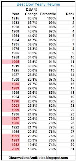
I have previously posted the best and worst stock market returns for periods from one to one hundred years -- usually as "rolling returns." In this post, we'll rank order the yearly returns from 1900 through 2012.

The Best Dow Yearly Returns since 1900


Best stock market yearly returns

The above table (click to expand) shows the best yearly performances of the DJIA (Dow Jones Industrial Average) index since 1900. I was originally going to show the top 25% (75th percentile and above), but expanded the range slightly to include 2009, a recent year of special interest. Note that the returns listed represent

Sunday, July 31, 2011

July 2011 Stock Market Update


Sovereign Debt Concerns

In July, sovereign debt issues again took center stage.

For months, fears of Greece defaulting on its debt and triggering a series of dominoes have hung over the market. After some jitters in the first half of the month, a plan was finally put in place to exchange much of the Greek debt for longer maturity (15-30 year) debt. This seems to have resolved the situation, at least for now, and sparked a short-lived relief rally.

Meanwhile, on the home front, the possibility of default on our own debt continued to increase. Lacking an increase in our debt ceiling, the government has been short of funds since May. However, it has managed to finesse the situation with the use of smoke and mirrors. August 2 is the supposed date when it would no longer be possible to keep up the charade. Faced with the possibility of

Saturday, July 23, 2011

100 Years of Inflation-Adjusted Housing Price History

(Last updated November, 2020)
Since owning a home is often a decades-long commitment, it is important that we include inflation in our housing analysis. This follow-up to 100 Years of (nominal) Housing Price History looks at the long-term history of inflation-adjusted residential real estate prices in the United States. Interestingly, you could make the case that, after adjusting for inflation, the long-term trend for housing prices has been {at least until fairly recently} pretty close to flat.

Real, Inflation-Adjusted, Housing Prices Since 1900


100 years of residential real estate property: real, inflation-adjusted housing prices (as of 2020)
Inflation-Adjusted U.S. Home Prices Since 1900

Above is a graph (click to enlarge) reflecting inflation-adjusted prices for residential housing in the United States since 1900. The graph is based on Robert Shiller's housing price index, which I have summarized to yearly data. His index attempts to

Monday, July 11, 2011

What Will My Bond or CD be Worth in 5 Years?

Here's an easy way to approximate what $5,000, $20,000, $50,000, or any other amount will grow to in 5 years. It works for bonds, CDs -- any investment that you expect to compound at a fixed annual rate. You can also use this graph to ballpark the results for multiples of 5 years -- e.g., 10, 15, 20 or 25 years.

NEW! Try my new interactive bond interest calculator. It does the same calculations as the graph below, but for any number of years, and for any interest rate. Then come back to this post; graphs are still better for seeing the big picture.

Because stock market results are not consistent, for stock market results see  the variability of 5-year stock market returns instead.

Approximates Results from the Calculator/Spreadsheet

The interactive bond calculator will give you precise results.  However, since the calculator may not work in some browsers, I'm providing this graph as a way to approximate the results.

What Will my Bond or CD be Worth in 5 Years?


5-year compound growth/ interest rate calculator/estimator for $5,000 $10,000 $15,000

The graph above (click to expand) shows how rapidly a bond or CD of any denomination will grow in five years. Given an interest rate, indicated on the horizontal axis, the "multiplier" on the vertical axis tells you what your investment will be worth in 5 years (assuming earnings reinvested each year, and no taxes). The multiplier is the same regardless of how much money you invest. For example,

Monday, July 4, 2011

June 2011 Stock Market Update


June, 2nd Quarter, Year-To-Date & Recovery-To-Date Review

European sovereign debt issues and the imminent ending of quantitative easing continued to weigh upon the market throughout the month. As a result, the downtrend that started last month continued. By mid-month, the market had been down 6 weeks in a row. Still, after all was said and done,

Wednesday, June 22, 2011

Why Investing in the Stock Market for Less Than 5 Years is Risky

This post provides justification for the adage that you should not put money into the stock market that you will need in less than 5 years. It is the 5-year version of earlier posts that discussed the distribution of 10 and 20-year stock market returns (see links below).

Some years back, a friend asked me to recommend a good stock investment for her daughter's college fund. Since withdrawals were to start in about three years, my recommendation was not to put the college fund in the stock market at all! Here's why.

What will a $20,000 Stock Market Investment be Worth in 5 Years?


variability & risk of short-term stock market investments

In previous posts, we have looked at the distribution of historical outcomes for typical (but hypothetical) investors investing in the stock market for 10 years and for 20 Years. For those holding periods, the investors virtually always made money -- though sometimes barely so. In approximately 100 sample 10-year periods since 1900, we saw only one instance where the investor's ending portfolio was worth less than his initial investment -- and no instances for 20-year periods.

The above graph (click to expand) is the 5-year version of the earlier charts. It shows the historical results of

Saturday, June 11, 2011

100-Year Housing Price Index History

(Last updated November, 2020)
This post illustrates the increase in U.S. housing prices since 1900. However, considering price alone is a misleading way to evaluate the performance of residential real estate. Investors who fail to do additional analysis are likely to overestimate the attractiveness of housing as an investment.

100-Year Housing Price Index Graph


100-year history of U.S. real estate/housing prices as of 2020
U.S. Housing Price Index (1900 - 2020)

The above chart (click to expand) shows a 100-year history of residential real estate prices in the U.S. The graph is based on Robert Shiller's historical housing index, which I have summarized to yearly data. As he readily admits, his data is

Wednesday, June 1, 2011

May 2011 Stock Market Update


May, Quarter-To-Date, Year-To-Date & Recovery-To-Date Review

The month started off with a bang -- literally. On the evening of May 1, POTUS (as the White House Twitter account refers to him) announced that Osama bin Laden had been shot and killed. The relief rally was short-lived, and was soon overshadowed by the bursting of the bubble in commodities. Silver dropped more than 25%, down from its highest levels since the Hunts tried to corner the silver market back in the 80's. Other commodities suffered as well, though not quite as much.

By mid-month, U.S. debt had reached its $14.924 Trillion limit, and some congressmen were threatening not to support raising the debt limit without major spending cuts. This raised the possibility, admittedly slight, that the U.S. could actually default on its debt. Sovereign debt issues continued in Europe as well, with the restructuring of Greek debt appearing more and more to be a question of

Sunday, May 22, 2011

The Impact of Starting P/E Ratio on 20-Year Stock Market Returns

One of the most dependable predictors of long-term stock market performance is the initial normalized price/earnings (P/E) ratio. This post uses a scatter plot to demonstrate the relationship that has existed historically between P/E and returns over the next 20 years.

Note: if you find the graph below difficult to understand, see Initial P/E and 20-Year Rolling Returns first.

Scatter Diagram: Starting P/E Ratio vs. 20-Year Stock Market Returns


starting/initial price/earnings ratio 20-year dow/stock market return/performance

The above scatter plot (click on image to expand) shows the historical relationship between the P/E ratio of the stock market at the time of purchase and the typical investor's return over the next 20 years. It is exactly analogous to the previously posted Starting P/E Ratio vs. 10-Year Stock Market Returns. And, both are conceptually related to Rolling Returns vs Initial P/E Ratios, which looked at the relationship of initial P/E and subsequent returns over time -- that is, with time as the horizontal axis.

Similar to the 10-year chart, each dot represents a hypothetical

Friday, May 13, 2011

What Would $10,000 in 19xx be Equivalent to Today?

Want to approximate what $1 in 1900 or 1929 or 1985 (or any other year) would be equivalent to today? How about what $100 or $1,000 today is equal to in past years? The graphs below will help you convert amounts in current 2012 dollars to amounts with the same buying/purchasing power in any prior year (beginning in 1900); you can also use it in the reverse direction. To see what today's dollar will be worth in the future, see What Will $100 be Worth 10 - 20 Years From Now?

NEW! Try my new interactive inflation calculator.  It does the same conversions as the graphs below, but you can convert from any year to any other year. Then come back to here; the graphs are still better for seeing the big picture.

I originally designed The Observations Inflation Spreadsheet to answer questions like the above, along with many other questions related to inflation and the impact of inflation on the dollar's purchasing power. The graphs below allow those without spreadsheets to approximate some of the spreadsheet's results.

What Was a Dollar in 19xx Worth vs. Today? e.g., What Was $10,000 in 1900 Equivalent to in 2012?


convert prior years dollar purchasing power to current 2012 dollars

The graph above (click to expand) converts dollar values from past years into their equivalent in today's dollars. For example,

Sunday, May 1, 2011

End of April 2011 Stock Market Update


April, Quarter-To-Date, Year-To-Date & Recovery-To-Date Review

After taking a month off, the market resumed its another-month-another-52-week-high advance. In fact, for the fourth of the last five months the market set a multi-year high -- this time besting levels last seen in 2008. All this while shrugging off yet another bit of bad news.

Last month, the Japanese earthquake, tsunami and near nuclear meltdown caused the market to "hiccup," and, ultimately cost it a chance to reach a multi-year high for the fourth month in a row. This month, the market received news that S&P, while continuing to rate U.S. debt as AAA, had changed the outlook for our debt from "Stable" to "Negative" -- for the first time in history. Not surprisingly, the market again "hiccupped" -- falling to

Wednesday, April 27, 2011

What Will $10,000 be Worth in 10 Years? (CDs, Bonds, Dollars...)

Here's an easy way to approximate what $10,000, or $100,000, or any other amount will be worth in 10 years. It works for bonds, CDs -- any investment that you expect to compound at a constant annual rate. You can even use it to ballpark the results for 20, 30, 40 or 50 years. (Note: to estimate returns for 5 years, and multiples of 5 years, see What Will my Bond or CD be Worth in 5 Years?.) In all cases, you supply the interest rate, and read the multiplier off the chart.

NEW! Try my new interactive bond interest calculator. It does the same calculations as the graph below, but for any number of years, and for any interest rate. Then come back to this post; graphs are still better for seeing the big picture.

For the future value a dollar, see What Will $100 be Worth in 10 - 20 Years? Finally, because stock market results are not consistent, for stock market results see What Will a $10,000 Stock Market Investment be Worth in 10 Years? instead.

Approximates Results From the Calculator

The interactive bond calculator will give you more accurate results. However, since the calculator may not work for all browsers, I'm providing this graph as a way to approximate the results.

What Will a $10,000 Bond/CD be Worth in 10 Years?


10 year compound growth/ interest rate calculator/estimator
Note: the multipliers (on the vertical axis) range from 1 to 10. The bottom (labelled) line corresponds to a multiplier of 1, the next (unlabelled) line to a multiplier of 2, etc. The lines are not the same distance apart because the vertical axis uses a log rather than linear scale (see about log graphs).

What Will a $10,000 Bond/CD be Worth in 10 Years at 10%?

In the graph above (click to expand), find 10% on the horizontal axis. The multiplier looks to be about 2 2/3 (it's actually 2.6). So, $10,000 at 10% for 10 years is approximately ($10,000 x 2.6=) $26,000.  The multiplier is the same regardless of how much money is invested. This same multiplier works for $1,000, $100,000, or $364.27.

Thursday, April 21, 2011

The Decrease in Purchasing Power of the U.S. Dollar Since 1900

(Last updated November, 2020)
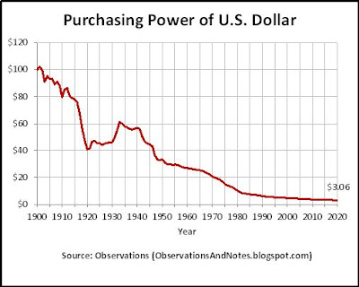
The declining value of the dollar is one of the biggest threats to retirees, and near retirees. This post explores the history of that decline over the past 100 years or so, with graphs going back to 1900.

One of the biggest threats to my own retirement plan is the cumulative impact that future inflation rates will have. Readers whose retirement income is not cost-of-living-adjusted need to evaluate the impact that inflation and the declining value of the dollar will have on their income, and be prepared to supplement their income as necessary.

Try my interactive inflation calculator that will convert any prior year dollars to any later year  right on your screen.  Then come back to this post and look at the bigger picture.

Decreasing Purchasing Power of the U.S. Dollar: What's $10,000 in 1900 Worth Today?


100 years of inflation history: declining value of the dollar. to 2020

The graph above (click to expand) shows that if a shopper were magically transported from the year 1900 to 2020, the $100 bill that he had in his wallet in 1900 would now be worth only $3.06! That is, $100 in 2020 would have the purchasing power that $3.06 had in 1900; $10,000 would be worth only $306 today. That's a 96.9% decrease in buying power. Our shopper would consider current dollars virtually worthless. (Note: the calculations in the post were made using my inflation calculator.)

The Cumulative Impact of Inflation on Retirement Planning

Since 1900, U.S inflation has averaged about 3.0% per year. However, even at that moderate rate, the cumulative effect is

Tuesday, April 12, 2011

The Observations Inflation Calculator/Spreadsheet

Last updated Sept 2020
This spreadsheet:
  • calculates the inflation rate between any two years between 1900 and 2020
  • converts dollar values from one year to another using the CPI (Consumer Price Index)
  • calculates the change in the purchasing power of a dollar
  • and more.
NEW! Try my new interactive calculator. It does all of the above right on your screen. The spreadsheet below is not interactive, but contains additional capabilities not included in the calculator.

Note:  If you don't have spreadsheet software, see the following easy-to-use graphs: What Would $10,000 in 19xx be Equivalent to Today? What Will $100 be Worth in 10-20 Years?, and "Related Materials" at the end of this post.

The Observations Inflation Calculator/Spreadsheet

Note: Click on the screenshot below to expand it. The link to download the spreadsheet is at the end of the post.

using CPI data to calculate purchasing power and value of a dollar in 2012
The Observations Inflation Calculator/Spreadsheet

What is that in today's dollars?

That's a question my readers sometimes ask -- especially when I'm reporting financial data from long before they were born. Since intuition is often useless when comparing dollar amounts from different eras, I've developed a calculator/spreadsheet to help.

The spreadsheet above can help answer questions such as:
  • My parents' house cost $50,000 in 1970. What would that be in today's dollars?
  • My current salary is $40,000/year. What was the equivalent 1985 salary?
  • What was the inflation rate between 1929 and 1935?
  • What will $100,000 be worth in 20 years?
  • What rate of return do I need to grow $10,000 into $30,000 in 10 years?

Sunday, April 3, 2011

Navigation Instructions Using the Graphical Navigator

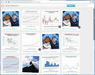
In my continuing effort to make Observations easier to navigate, I'm trying out a new navigation tool. It looks like this


You can access it by clicking on the image above, or the similar image located in the sidebar on the left.

Note: These views require modern browsers such as Internet Explorer 8+, Firefox 3.5+, Chrome or Safari -- else, will just take you back to the Home page.

Basic Navigation in the Snapshot View

Once you click on the image you will see:
  • a snapshot from each Observations post, with the first 30 characters of the title -- similar to 12 snapshots in the image above, but larger.
  • Mouse over any snapshot and you will see a short snippet from the post -- the first sentence or two.
  • Click on a snapshot and you will be taken to the post. You will get the "short feed" for the post -- the first 200 words or so. (Note: You can navigate through the short feeds by using your <- and -> keys, or clicking on "older" or "newer" at the top of the page. "Back to all Posts" takes you back to the initial view.)
  • To see the full post, click on the post title, or click on Read More at the end of the short feed.

Friday, April 1, 2011

March 2011 Stock Market Update


March, Year-To-Date & Recovery-To-Date Review
Note: Click here for April 2011 stock market results

For the first time in months, the stock market did not set a multi-year high. The pullback that started last month amid concerns about unrest in the Middle East, and the resulting increase in oil prices, continued as the disturbances spread and escalated -- even to the point of U.S. (limited) military involvement.

Fukushima-Daiichi Nuclear Plant Incident

In addition, one of the largest earthquakes in recent memory (9.0 on the Richter scale) struck Japan. The earthquake caused not only major damage and scores of aftershocks, but still another tsunami. The combination of the earthquakes and the tsunami caused widespread devastation in Japan; one result was enough damage to the Fukushima nuclear power plant to ultimately cause radiation leakage and raise the possibility of a nuclear meltdown. It also raised the possibility of worldwide supply disruptions, especially in the automotive and electronics industries, in a global economy supplied by "just-in-time" (JIT) inventories.
(Note: for explanations of what happened in the Fukushima-Daiichi nuclear plant incident, see Anatomy of a Nuclear Crisis: A Chronology of Fukushima or this excellent PowerPoint presentation by Areva.)

Not surprisingly, the market "hiccupped" -- falling as low as

Thursday, March 24, 2011

100-Years of Inflation-Adjusted Stock Market History

When analyzing stock market performance over multiple years, it is important that you consider inflation-adjusted performance. The more years being evaluated, the more important it is to include the impact of inflation. If you don't adjust for inflation, you're comparing apples and bananas. Previously, I've suggested that you at least mentally factor in the impact; in this post, we'll update the 100-year stock market chart to make that "factoring in" explicit.

100-Year Stock Market Graph -- Inflation-Adjusted


100-year stock market history in  inflation-adjusted constant 2012 dollars

In the chart above (click to expand), the red line shows Dow Jones Index year-end closing prices in "then current" dollars -- as they were reported at the time. That is how you normally see them, and how they were displayed in my original 100-year stock market graph. In that original chart, you could see that the Dow is now more than 100 times higher than it was in 1900! But what does that really mean? Does it mean that if some (very) long-lived soul had invested $1 in the stock market in 1900 it would now be worth more than $100? Yes, but that's misleading because you're comparing apples and cumquats; the first amount is

Tuesday, March 15, 2011

100 Years of Inflation Rate History

Inflation can be devastating; while it has been under control for the past 25 years, there is no guarantee that it will remain so. Since this blog emphasizes long-term planning, it is important that we address the issue of inflation, and the impact that the declining purchasing power of the dollar has on our investments. For perspective, as always, let's first look at the past century.

U.S. Inflation Rates since 1900

Yearly change in consumer price index (CPI-U) 1900-2012
U.S. Yearly Inflation since 1900

The above chart shows the yearly rate of inflation as measured by the Consumer Price Index for All Urban Consumers (CPI-U) for the past 100 years. By early 2012, prices were more than 28 times higher than in 1900 -- the CPI increased from 7.9 to 226.7. Phrased differently, a dollar buys 28 times less now than a dollar bought in 1900 (see inflation calculator). While inflation has averaged only 3% for the complete period, and also 3% since 1982, such subdued inflation has clearly not always been the case. The graph shows several periods where inflation rose to 10% or more. Here's a quick summary of inflation's impact on some key areas.

The Impact of Inflation: A Dollar Buys a Lot Less Than it Used To

Inflation increases the

Tuesday, March 1, 2011

March 2011 Stock Market Update


February, Year-To-Date & Recovery-To-Date Review
Note: Click here for April update with March 2011 stock market results


The market continues its remarkable recovery; in February the market again reached a multi-year high. The DJIA (Dow Jones Industrial Average) closed February at 12,226.34, after a late month pullback from its high close of 12,391.25 on February 18. The pullback was sparked by unrest in the Middle East and the resultant run-up in oil prices.


Here's a summary of the extent of the advances after this remarkable 2-year run:
  • From Prior Month Close of 11,892: The Dow is up 334 points (2.8%)
  • From December/EOY Close of 11,578: Up 649 points (5.6%)
  • From Recent Low of 9986 on August 26, 2010: Up 2241 points (22.4%)
  • From 52-Week Low of 9686 on July 2, 2010: Up 2540 points (26.2%)
  • From Crash Low

Tuesday, February 15, 2011

Borrowing Returns from the Future

This post suggests that the price of extraordinary current stock market performance may be decreased future returns.

Starting P/E Ratio vs. 10-Year Stock Market Returns clearly suggested that high initial P/E ratios have a negative impact on subsequent 10-year returns. This post takes the analysis a step further in an attempt to see what we can learn from the "outliers" -- the historical results that are least consistent with the trend line.

Initial P/E Ratio vs. 10-Year Stock Market Performance Revisited


P/E ratio impact on future 10-year performance

Each marker in the chart above (click to expand) represents a year between 1901 and 2010. The placement of the marker indicates the Dow's normalized P/E ratio at the end of that year, and the annualized market return over the ensuing 10 years. The green trend line shows that, in general, every time the P/E ratio increased by 5, the annualized 10-year returns decreased by about 3% per year. (For a more complete explanation of the basic chart, see note at end of post and this post.)

In my experience, it is always helpful to look at the exceptions. So, in this version of the chart, I've added

Tuesday, February 8, 2011

The Importance of Avoiding Large Stock Market Losses

During the 2008-2009 stock market crash, the DJIA (Dow Jones Industrial Average) fell 54% - to a low close of 6547 on March 9, 2009. In a February, 2011 post , I observed that since that low the market was up over 80%. Yet, it was still more than 15%, and more than 2000 points, below the all-time high of 14,164! How can a 54% loss be more than an 80% gain? Read on....

Gains Needed to Offset Stock Market Losses


impact of stock market losses -- how large losses wipe out much larger gains

The Impact of Large Stock Market Losses

The above chart (click to expand) shows the gain required to offset losses from 0% to 90%. I wanted to go even beyond a 90% loss, but if you want to see what happens beyond that,

Tuesday, February 1, 2011

February 2011 Stock Market Update


January & Recovery-To-Date Review
Note: click here for February data

The market is off to an auspicious start -- which usually bodes well for the year.  In January, the market again set not only a new 52-week high, but a multi-year high as well.  The  DJIA (Dow Jones Industrial Average) closed January at 11,891.93, just below its high for the month of 11,989.83 set on January 27th.  That peak appears to be the highest close since June 17, 2008 -- the last time the market closed above 12,000.

The market is going full speed ahead. It spent the end of January knocking at the door of 12,000.  For five days in a row, the market peaked above 12,000 only to fall back before the close. Here's how the January close stacks up against some benchmark earlier closes:
  • From December/EOY Close of 11,578: The Dow is up 314 point (2.7%)
  • From Recent Low of 9986 on August 26, 2010: Up 1906 points (19.1%)
  • From 52-Week Low of 9686 on July 2, 2010: Up 2205 points (22.8%)!
  • From Crash Low

Thursday, January 20, 2011

The Impact of Starting P/E Ratio on 10-Year Stock Market Returns

(Last updated Sept 2020, but very insensitive to yearly changes)
One of the most dependable predictors of long-term stock market performance is the initial normalized price/earnings (P/E) ratio. This post uses a scatter graph to demonstrate the relationship that has existed between P/E and future returns over the past century.

Note: if you find the graph below difficult to understand, see Initial P/E and 10-Year Rolling Returns first.

Scatter Diagram: Starting P/E Ratio vs. 10-Year Stock Market Returns


Impact of starting/initial p/e ratio on 10-year Dow/stock market ROI/performance 2020

The above scatter plot (click on image to expand) shows the historical relationship between the P/E ratio of the stock market at the time of purchase and the theoretical investors' returns over the next 10 years. We've looked at this relationship before; for example, Rolling Returns vs Initial P/E Ratios looked at the relationship of initial P/E and subsequent returns over time -- that is, with time as the horizontal axis. However, this time we're going to take time out of the equation; it's just starting P/E ratio vs. 10-year return -- "man to man" so to speak.

In the chart, each dot represents a hypothetical

Friday, January 7, 2011

Stock Market Returns through 2009

In case you haven't noticed, this blog takes a strategic, very-long-term view of just about everything. Most of the analysis and graphs deal with a century of data. In my view, another year or two of data is, in most cases, unnecessary. Generally, the message is the same whether you look at results through 2008, e.g., or through 2010. In those few cases where I think it most important, I will update posts/graphs annually; others will be updated much less frequently.

Since I only update a few key graphs annually, I thought it might prove useful to preserve last year's version of the "Market Returns Since 19xx" post for those readers who feel compelled to put the last dot on every chart. If the information below is not sufficient, the supporting data for all stock market related charts is available in my stock market analysis models on Google Docs.

Results Through 2009

The average yearly total return (i.e., including dividends) for the stock market for periods of 25 years or longer has been around 9-10%. Following are the results for some key periods ending at year-end 2009:
  • The average total yearly return of the Dow Index from 1900 (end-of-year 1899) through 2009 was approximately 9.4%  -- 4.7% price appreciation, plus approx 4.7% in dividends.
  • The return from 1929 (End-of-year 1928 -- i.e., before the crash) was 8.8% (4.5%, plus 4.3%)
  • From end-of-year 1932 (i.e., after the crash) - 2009: 11.1% (6.9%, plus 4.2%)
  • For the last twenty-five calendar years, the annual return was 11.9% (9.0%, plus 2.9%)
  • For the last 20 years, 9.4% (6.9%, plus 2.5%)
  • For the last 10 years, 1.3% (-1.0%, plus 2.3%)
  • For the last 5 years, 1.9% (-0.7%, plus 2.6%)
  • For 2009 the stock market (Dow/DJIA) total return was 22.0% (18.8% plus 3.2%)
  • 2009 Year-end Dividend Yield was 2.7%
  • For comparable results for similar periods ending the following year, see
    Average Stock Market Returns: 19xx thru 2010.

For lists of other popular posts, and a complete index of all stock market posts by subject area, see the sidebar on the left.


In all cases above, the returns are from year-end to year-end. In addition, by "stock market" I mean the DJIA (Dow Jones Industrial Average). The results would be essentially the same for the S&P 500.  Note: dividends prior to 1929 have been estimated based upon another stock market index.

Copyright © 2010.   Last modified: 1/4/2013

Thursday, January 6, 2011

Key Posts, Charts Updated Through 2010

It just occurred to me that readers following this blog via the normal feeds (Google Reader, Newsgator, etc.) are only notified of new posts/comments. For readers not following Observations on Twitter (www.twitter.com/obsandnotes), where I announce not only new posts but key updates, following are a couple of Observations posts that have recently been updated to reflect stock market results through year-end 2010.

Stock Market Annual Performance Chart: The graph now includes 1929 through 2010
Average Stock Market Total Return: Now includes results for key periods from 19xx through 2010 (e.g., 1, 5 & 10 years, since 1900, 1929, etc.)

In addition, as you know, 2010 End-of-Year Stock Market Update includes shorter-term results such as for December, the fourth quarter, and since recent lows -- plus some key stats for the S&P 500 and NASDAQ. It also includes an update to the graph in 100 Years of Stock Market History.

Finally, the Stock Market Analysis Models have been updated to include 2010 closing prices and dividends.  I'll have additional updates when earnings become available around the end of this quarter.

For lists of other popular posts and an index of stock market posts, by subject area, see the sidebar to the left. This work is licensed under a Creative Commons Attribution 3.0 unported license. Last modified: n/a

Saturday, January 1, 2011

2010 End-of-Year Stock Market Update

Long-term 100 year stock market (Dow) history/trend chart, moving average
100-Year Stock Market Chart through 2010

Note: For 2011, see 2011 End-of-Year Stock Market Update.

December, 4th Quarter, Year-To-Date & Recovery-To-Date Review

The market ended the year with a bang, tacking on almost as many points in December as it had from January through November.  In the process, it set not only a new 52-week high, but a multi-year high.  The  DJIA (Dow Jones Industrial Average) ended the year at 11,577.51, after peaking at 11,585 on December 29th.  That peak was the highest close since August, 28, 2008 when the financial/credit crisis started the market on its stomach-churning crash to 6,547. At year-end, the dividend yield was 2.48%.

Almost no matter how you look at it, we're on a roll.  Here's how the December close stacks up against some earlier closes:
  • From Prior Month Close of 11,007: The Dow is up 571 point (5.2%)!
  • From 3rd Quarter Close of 10,788: Up 789 points (7.3%)
  • From 2009 Close of